
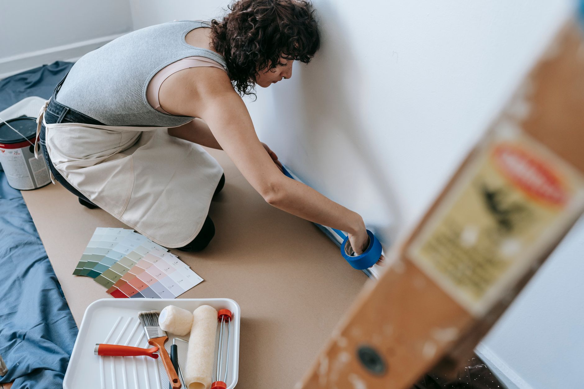
Keeping up with home colour trends doesn't mean chasing every seasonal shift on Instagram. The palettes worth paying attention to are the ones with staying power: colours that photograph well, feel comfortable to live in, and age gracefully between repaints. In 2026, the direction is clear. Warmer neutrals, nature-led tones, and thoughtful feature colours are dominating both interior and exterior decisions across Melbourne and beyond.
Why colour trends matter when you repaint
Paint is one of the fastest and most cost-effective ways to refresh a home. Choosing a colour that feels current adds a layer of appeal whether you're repainting for yourself or with a future sale in mind. That said, "on trend" should always be weighed against your home's architecture, natural light, and existing finishes. A colour that looks stunning in a Fitzroy terrace may feel out of place on a brick veneer in the suburbs. The best approach is to use trends as a starting point, not a prescription.
If you're thinking about how colour choices interact with property value, the article on how to increase home value with paint is worth reading before you commit to a palette. It covers which rooms and surfaces tend to deliver the strongest return on a repaint investment.
Interior colour trends shaping 2026
Warm whites and off-whites
Cool, blue-toned whites have been the default for years, but the shift toward warmth is well underway. Creamy whites, linen tones, and soft stone shades are replacing stark Dulux White on White in living areas and bedrooms. These tones work particularly well in Melbourne homes where natural light can be flat or south-facing, because they read as warm rather than grey.
Earthy mid-tones
Terracotta, clay, dusty ochre, and warm taupe have moved from accent territory into main wall colours. These earthy mid-tones pair easily with natural materials like timber, rattan, and linen, which continue to dominate interior styling. They also age well: a terracotta living room that looked bold in year one tends to settle into something that feels quietly distinguished by year five.
Deep, enveloping colours for feature walls and studies
There's growing confidence in using deep, saturated colours in rooms where immersion matters. Ink navy, forest green, charcoal, and deep plum are popular choices for home offices, studies, and reading nooks. These shades absorb light and create a sense of focus and calm, which ties directly into what we know about colour psychology and how paint colours affect mood. A deep green study can genuinely feel different to work in compared with a standard white room.
Sage and muted greens
Sage has been trending for several years and shows no sign of fading. What's changing is the range of greens entering the conversation: dusty eucalyptus, muted olive, and grey-green blends are all appearing in kitchens, bathrooms, and bedrooms. These colours connect interiors to the garden and the landscape, which resonates particularly well in Australian homes.
Exterior colour trends worth watching
Exterior colour has different rules. It needs to work at scale, read well from the street, and hold up under UV exposure over years rather than months. The trends here tend to move more slowly than interior fashion, which is a good thing.
Dark exteriors remain popular, particularly in charcoal, dark grey, and deep forest tones on weatherboard and fibre cement cladding. On brick homes, limewash and lime paint finishes in warm whites and soft stone tones are increasingly common, softening the harshness of older red brick. Colorbond fencing and roofing in earthy neutrals such as Basalt and Dune continues to complement both dark and light exterior palettes well.
For a more detailed walkthrough of how to match colours to your home's architecture and street context, the guide on how to choose the right exterior paint colour for your home covers the practical steps from shortlisting to final sign-off.
Colours to approach with caution
Not every trend translates well in the long term. Highly saturated feature colours in main living areas can feel dated within a few years, and repainting over deep jewel tones often requires extra primer coats and labour. Cool grey, once the dominant neutral of the 2010s, now reads as slightly dated in many contexts, particularly when used across an entire interior. If you're considering a colour that feels genuinely bold, it's worth limiting it to a room or surface you'd be comfortable repainting in three to five years.
How to test colours before you commit
Colour behaves differently at scale. A sample pot brushed onto a large sheet of white card, viewed at different times of day and in different parts of the room, will tell you far more than a paint chip. Digital visualiser tools from major paint brands can help, but they're not a substitute for a physical sample in your actual space. Natural light in Melbourne varies enormously between north-facing and south-facing rooms, so test the same colour in both conditions before deciding.
Shortlist two or three options, paint large swatches (at least A3 size), and live with them for a couple of days. The colour you gravitate toward consistently is usually the right one.
Getting the most from a colour refresh
A colour change is only as good as the preparation and application behind it. Poorly prepared surfaces, inadequate priming, and cheap paint will undermine even the most considered palette. Quality paint from established Australian brands, applied correctly over a properly prepared surface, will hold colour better, resist staining, and wash down more easily over its lifespan. If you're budgeting a repaint, understanding what drives costs will help you allocate spend wisely: the home painting cost guide for Melbourne breaks down labour, materials, and the variables that affect the final figure.
The right colour, applied well, can transform how a space feels to live in. Start with a palette that suits your home and your lifestyle, draw on what's current without being beholden to it, and invest in quality where it counts.