
Walk into a pale blue room and notice how your shoulders drop. Step into a bright red kitchen and feel your pulse quicken slightly. These reactions are not random. Colour psychology is the study of how hues influence human emotion, behaviour and mental state, and it has very practical implications for the paint choices you make at home. Whether you are refreshing a single bedroom or overhauling the whole house, understanding what your colours are doing to the people inside can make every decision more intentional.
Why colour affects how we feel
The human brain processes colour almost instantly, triggering associations built from culture, memory and biology. Warm colours (reds, oranges and yellows) tend to stimulate the nervous system, raise energy levels and encourage conversation. Cool colours (blues, greens and purples) tend to slow breathing, lower perceived temperature and promote calm. Neutral tones sit somewhere in between, offering flexibility but rarely delivering the emotional punch of a saturated hue. None of these effects are absolute, because personal associations always play a role, but the broad patterns are consistent enough to use as a practical guide.
Room-by-room colour guide
Bedrooms: lean into calm
The bedroom is where your nervous system needs to wind down. Soft blues, dusty sage greens, warm lavenders and muted blush tones all support relaxation and sleep. Avoid heavily saturated or high-contrast colours on all four walls; they can keep the mind alert when you want it to switch off. A deep charcoal or navy used on a single feature wall can feel cocooning and restful without dominating the space.
Living rooms: find the balance
Living rooms serve multiple purposes: socialising, relaxing, watching television, working from a laptop. The ideal palette is warm but not overstimulating. Earthy terracottas, warm whites, greyed greens and soft caramels all work well. Avoid hard, cool whites if the room faces south and receives limited natural light; they read flat and chilly rather than clean and fresh. A warm neutral base with one richer accent wall gives you energy without fatigue.
Kitchens: appetite and energy
Yellows and warm whites have long been favoured in kitchens because they suggest warmth, optimism and appetite. Deep greens have become popular more recently because they feel grounded and natural alongside timber and stone. Red accents can stimulate appetite but should be used sparingly; as the dominant colour in a kitchen they can feel aggressive once the novelty wears off.
Home offices: focus without fatigue
Productive work needs a colour that keeps you alert without causing stress. Muted greens and soft blues are strong choices because they reduce eye strain and sustain concentration. Avoid very pale greys with a blue or purple undertone; they can read as cool and uninviting under artificial light, which is draining over long working hours. A warm off-white or a subtle sage keeps the room feeling professional and clear-headed.
Bathrooms: clean and restoring
Bathrooms respond well to spa-like palettes: soft aquas, cool whites, pale greens and warm stones. These colours reinforce a sense of cleanliness and make the brief ritual of getting ready feel more restorative. Small bathrooms benefit from light, receding colours that push the walls outward visually. Larger bathrooms can carry deeper, more dramatic tones without feeling cramped.
Undertones matter more than you think
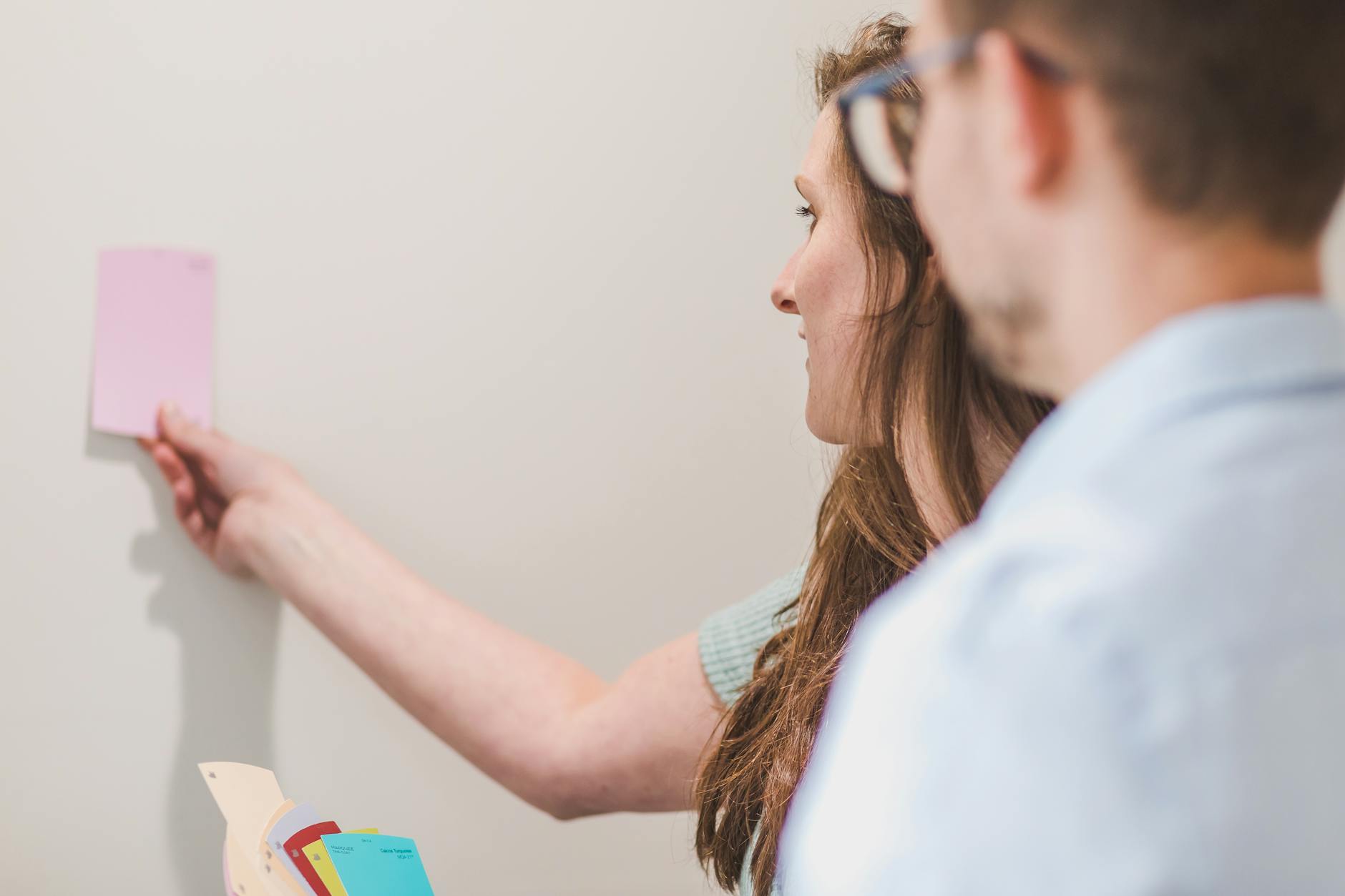
A colour's undertone is the hidden hue sitting beneath the surface. A white can be warm (yellow or pink undertone) or cool (blue or green undertone), and placing the wrong one in a room can make the whole scheme feel off without you being able to identify why. Before committing to any colour, test a large sample patch (at least an A4 sheet) on your actual wall, and observe it at different times of day. Natural morning light and artificial evening light can reveal undertones that are invisible in the paint store.
This is especially important when you are choosing exterior colours. The way sunlight moves across a facade throughout the day shifts the apparent tone dramatically. Our practical guide to choosing the right exterior paint colour for your home walks through how to account for aspect, light and neighbouring properties when making that decision.
Saturation and finish: the other two levers
Colour psychology is not only about hue. Saturation (how vivid or muted a colour is) and finish (matte, eggshell, satin or gloss) also shape the emotional response. Heavily saturated colours are energising in small doses but exhausting in large rooms or on all four walls. Muted, greyed-down versions of the same hue tend to feel more sophisticated and liveable over the long term. As for finish, matte absorbs light and feels soft and intimate; gloss reflects light and feels dynamic and crisp. In living spaces, eggshell and low-sheen finishes usually strike the best balance between the two.
Putting it into practice
Start with the emotional intention for each room. Ask what you need the space to do: rest, focus, socialise, create. Then work backwards from that goal to a hue family, then a specific colour, then a saturation level. If you are unsure how a scheme will read once it is on the walls, it is worth consulting a professional painter before committing. The cost of a test pot and an expert eye is far less than repainting a room twice. Speaking of which, if you are planning to do some of the work yourself, our guide on how to repaint a room without making a mess covers preparation and technique in practical detail.
Colour is one of the most affordable ways to change how a home feels, and understanding the psychology behind it means you can make choices with confidence rather than guessing. Get the hues right and every room can do its job a little better, every single day.