
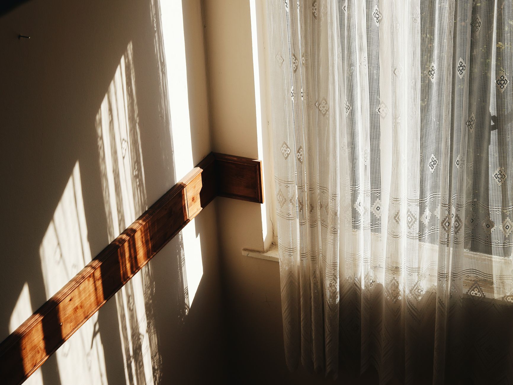
East-facing rooms have a particular rhythm. They fill with sharp, bluish morning light from sunrise until roughly mid-morning, then soften into a neutral, shadowed tone for the rest of the day. That shift happens fast, and it changes the way paint colours read on the wall. Getting the colour choice right means understanding both ends of that daily cycle.
Why east-facing light is tricky for paint
Morning light in an east-facing room sits on the cooler side of the colour temperature scale. It's bright, but it carries a blue-white quality that boosts cool tones and drains warmth from mid-toned neutrals. A colour that looks like a gentle greige on a paint chip can read almost grey by 9am. By early afternoon, when the light retreats, that same wall shifts again toward a flat, underwhelming tone.
The challenge is not just picking one colour that works in one condition. It's picking a colour that holds up across two very different lighting moods within the same day.
Colours that work well in east-facing rooms
Warm whites are one of the most reliable choices. A white with yellow, peach or pink undertones catches the morning cool and neutralises it rather than amplifying it. Products in the Dulux Antique White USA family or similar warm-white ranges from Taubmans perform well because the yellow base stops the wall from reading icy when the morning sun hits. The same warmth reads comfortably in the softer afternoon light.
Soft terracotta and warm blush tones also respond well. The morning light keeps them from feeling heavy, and the cooler afternoon light gives them enough depth to stay interesting. These shades work particularly well in bedrooms, where the morning brightness feels energising rather than jarring.
Muted sage greens sit in a useful middle ground. They're neither strongly warm nor strongly cool, so they don't get punished by either end of the east-facing light cycle. A sage with grey undertones can feel fresh in the morning and calming in the afternoon.
Colours to avoid
Cool greys and blue-greys are the riskiest choices. Morning light amplifies the blue already in them. By 8am, a colour described as "soft grey" on the tin can read almost clinical on the wall. Save those tones for south-facing rooms, where the consistent cool light keeps them stable. If you're drawn to grey, steer toward a warm grey with clear brown or pink undertones.
Bright whites with stark cool undertones create a similar problem. They look crisp in the morning but can feel flat and lifeless once the direct light is gone. The room loses its sense of warmth for most of the waking day.
Very dark colours also need care. An east-facing room that's dark from midday onward can feel oppressive if the colour absorbs what little ambient light remains. Dark paint can work, but it requires generous artificial lighting to compensate.
How sheen level interacts with east-facing light
High-sheen finishes intensify light, and intense morning light plus a high sheen can produce glare that makes the room uncomfortable in the early hours. A low sheen, such as a low-sheen or flat finish, diffuses that sharp morning brightness and keeps colours looking truer. Choosing the right tone matters, but so does the surface you're putting it on. For east-facing living areas and bedrooms, low-sheen is worth specifying for the walls even if you'd normally default to something higher.
Ceilings in east-facing rooms benefit from a bright, warm white in flat finish. That ceiling bounces and softens the morning light rather than reflecting it back as glare.
Testing before you commit
No paint chip, digital visualiser or photo comes close to replacing a large-scale test patch. Paint at least an A2-sized swatch of your shortlisted colours directly onto the wall, and observe them at three specific times: before 9am, around noon, and in the early evening with artificial light on. A colour that passes all three tests is a safe bet. One that only looks right in one condition will disappoint you the other two-thirds of the day.
Paint two or three options side by side if you can. The contrast between them under shifting light is far more informative than looking at any single colour in isolation. This is especially important when you're working with neutrals, where the difference between a warm and cool undertone can be nearly invisible on a chip and obvious on a wall.
East-facing rooms used as bedrooms
An east-facing bedroom is unusual because the light peaks at exactly the time you're waking up. That's a real asset if you want natural light to help you rise, but it demands colours that don't feel harsh in the morning. Warm blush, soft terracotta and peachy off-whites create a gentle, energising morning atmosphere without overwhelming the senses. These rooms don't need the sleep-oriented muted palette you'd reach for in a west- or north-facing bedroom. For context on how orientation shapes bedroom colour decisions, the principles around choosing paint colours for a bedroom that help you sleep apply differently depending on which way the windows face.
East-facing rooms as living or dining spaces
A dining room or kitchen that faces east gets its best light exactly when you want it for breakfast and morning meals. Warm, saturated colours like deep amber, warm mustard or rich ochre make the most of that morning energy. These tones hold their character when the light drops off, because their depth and saturation carry them through the flatter afternoon. A pale, muted version of the same colour family won't have that carrying power and can feel washed out by midday.
For open-plan spaces where the east-facing zone connects to a room with a different orientation, creating visual flow between rooms with a connected but not identical palette keeps the transition from feeling abrupt. A warm white in the connecting hallway can bridge an east-facing ochre dining area and a north-facing neutral living space without either colour looking out of place.
Working with what the light gives you
East-facing rooms reward colour choices that lean warm without going heavy. The morning light does the drama; the colour needs to work with it, not fight it. Start with warm whites and soft mid-tones, test them across the full daily light cycle, and keep the sheen level low enough to avoid glare. Do that and the room works well from sunrise to evening.