
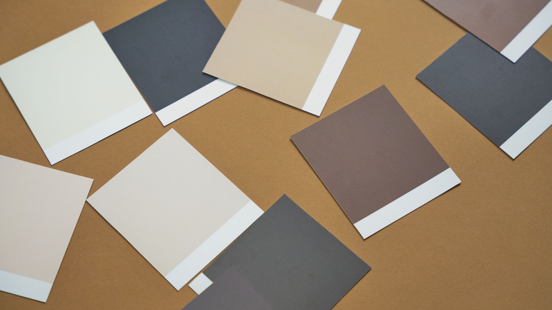
When it comes to choosing paint colours, the warm-versus-cool question sits at the heart of almost every decorating decision. Warm paint colours, those built on reds, oranges, yellows and earthy neutrals, do something fundamentally different to a room than cool ones built on blues, greens, purples and crisp whites. Understanding that difference is what separates a room that feels considered from one that just feels off. This guide breaks down how each family of tones works, what they do to mood and perception of space, and how to pick the right one for your home.
What makes a colour warm or cool?
Every paint colour sits somewhere on a temperature spectrum, even shades that look neutral at first glance. Warm colours are those that lean toward the red and yellow end of the spectrum. Think terracotta, amber, sage with a golden undertone, creamy off-white, and deep rust. They evoke sunlight, earth, fire and natural materials. Cool colours lean toward blue and green. Think slate, icy lavender, ocean teal, crisp white with a blue undertone, and smoky grey. They evoke water, sky, shadow and stone.
The tricky part is that many colours exist somewhere in the middle. A grey can read warm (if it has a pink or beige base) or cool (if it has a blue or green base). Testing a colour chip in the actual room, in natural and artificial light, is the only way to know for certain where it will land.
How warm colours affect a room
Warm tones are energising and enveloping. They draw walls inward, making a large or sparse space feel more intimate and lived-in. A generous hallway painted in a deep terracotta or a warm ochre suddenly feels welcoming rather than cavernous. In dining rooms, warm colours encourage conversation and appetite, which is why earthy reds and golden yellows have long been a favourite for that space.
There is a reason colour psychology research consistently links warm hues to elevated mood and sociability. Warmer rooms tend to feel busier and more stimulating, which makes them well suited to social spaces: living rooms, dining areas, kitchens and studies where energy is welcome. The trade-off is that very saturated warm tones in small rooms with limited natural light can tip from cosy into oppressive. The key is modulation. A warm white or a muted dusty rose gives you the effect without the intensity.
How cool colours affect a room
Cool tones do the opposite. They push walls outward, creating a sense of space and airiness. A small bathroom painted in a soft blue-grey feels notably larger and calmer than the same room in a warm cream. Bedrooms, bathrooms and home offices often respond well to cooler palettes because those are the spaces where calm focus or restorative quiet is the goal.
Cool colours also work well in south-facing rooms that receive less direct sunlight, though there is a nuance here worth noting. In Melbourne's climate, a room that is already cold and dim can feel bleak if pushed too far into the cool spectrum. A muted sage or a soft blue-green with a warm undertone is often a better fit than a stark ice blue in those situations.
Light changes everything
Natural light is the single biggest variable in how a paint colour reads. A north-facing Melbourne room bathed in afternoon sun can handle cooler tones without feeling cold. A south-facing room with limited direct light often needs a warmer palette to avoid feeling gloomy. The orientation of your windows, the time of day the room gets the most use, and the colour temperature of your artificial lighting all play into this.
LED lights with a warm white rating (2700K–3000K) will amplify warm tones and soften cool ones. Daylight LEDs (5000K and above) do the reverse. If you are painting a room that relies heavily on artificial lighting in the evenings, test your paint swatches under those bulbs as well as in natural light. A colour can look entirely different at 7pm than it does at noon.
Combining warm and cool in the same space
A common mistake is treating a room as either fully warm or fully cool. In reality, the most satisfying interiors usually mix both. A deep blue wall looks grounded and rich when paired with warm timber floors and brass fittings. A warm terracotta room feels balanced when offset with a cool-toned linen sofa and white trim. The relationship between the tones is what creates depth.
If you are working on a feature wall rather than a full room repaint, choosing an accent wall colour that contrasts in temperature with the rest of the room is a reliable way to add visual interest without overwhelming the space. A warm terracotta feature wall in a room with cool grey walls and white ceilings, for example, creates a focal point that feels intentional and designed.
Practical room-by-room guidance
- Living rooms: Warm neutrals such as stone, wheat and greige suit social living rooms. Cool greens and blues work well in calm, reading-focused spaces.
- Bedrooms: Soft cool tones (pale blue, dusty lavender, muted sage) support rest. Warm tones work in bedrooms that feel too stark or cavernous, particularly in muted, low-saturation versions.
- Kitchens: Warm whites, soft sage and warm timber-adjacent tones are popular. Avoid very cool stark whites unless you have excellent natural light and warm materials to balance them.
- Bathrooms: Cool blues and soft greens suit wet rooms and evoke cleanliness. A small bathroom can go warmer if you want a spa-like, cocoon effect.
- Home offices: Muted cool tones support concentration. Avoid high-saturation warm colours that compete for attention.
- Hallways and entries: Warm tones create an inviting first impression. Dark, dramatic tones (warm or cool) can work well in hallways where commitment to a bold colour is lower risk.
Staying current without chasing trends
The colour trends shaping homes in 2026 lean heavily toward warm, earthy and grounded palettes, moving away from the cool grey saturation that dominated a decade of Australian interiors. That shift reflects a broader cultural appetite for warmth and texture. Even so, the best colour choice is always the one that suits your specific room, your light conditions and how you use the space, not simply whatever is fashionable this season. Trends are useful as a confidence check (if everyone is embracing warm terracotta, you can feel secure that it reads as contemporary), but they should not override what genuinely works for your home.
When in doubt, commit to a direction and test it properly. Buy sample pots, paint A4-sized patches on at least two walls, and live with them for two days. Observe how they look at different times of day and under your usual artificial lighting. The colour that feels right at 2pm in full sun and still feels right at 8pm under a lamp is the one to commit to.