
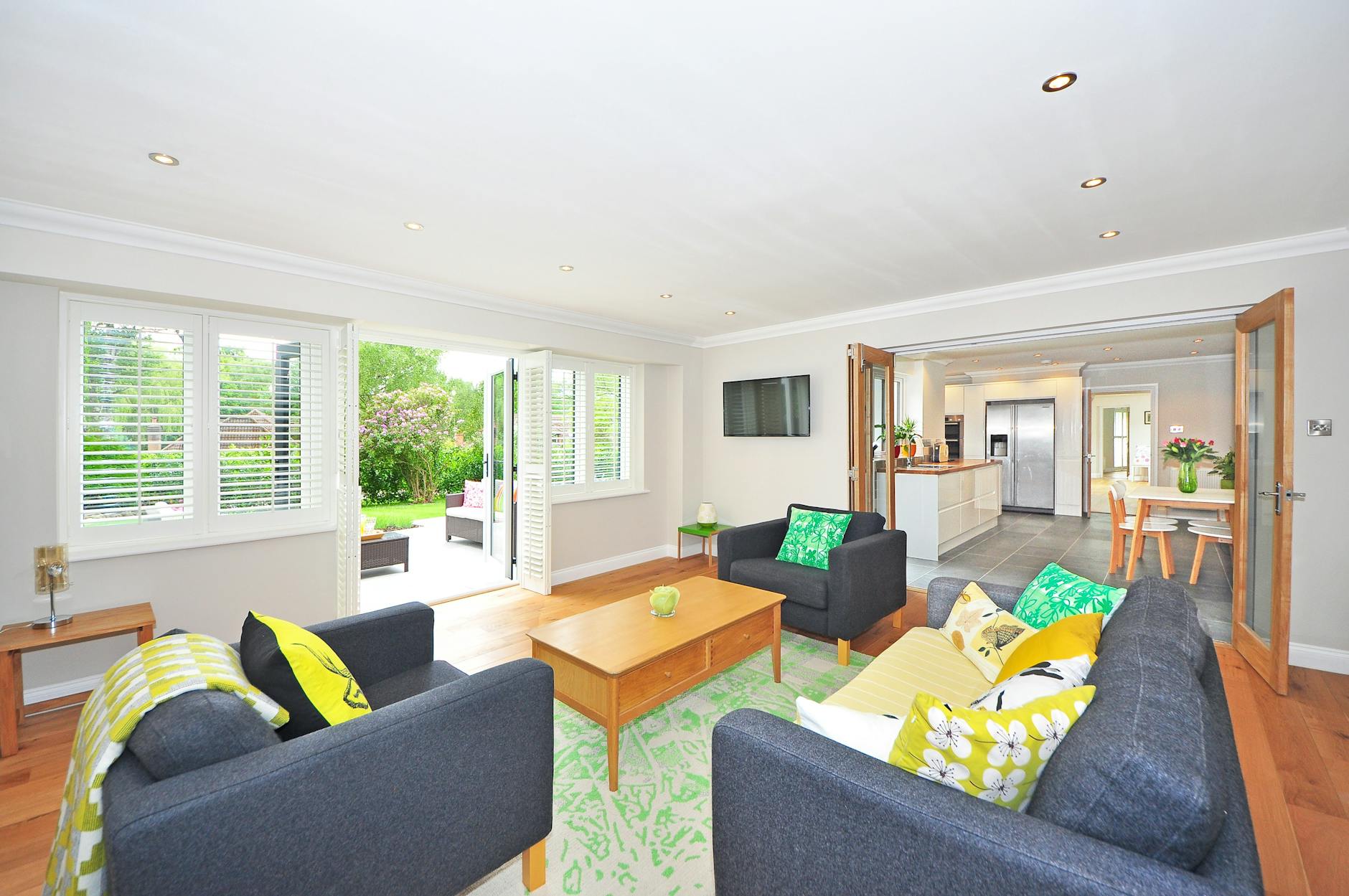
Paint colour flow is one of those things you notice most when it's absent. Walk through a home where every room has been chosen in isolation and the effect is jarring: a deep teal kitchen bumping into a cool grey hallway, then a warm beige living room. No single colour is wrong, but together they read as disconnected. Apex Painting works with Melbourne homeowners on this exact problem, and the fix almost always starts not with picking colours, but with understanding how rooms relate to each other spatially and visually.
Why connected rooms need a shared logic
When two rooms share a sightline, their colours are always in conversation. Stand at the front door of most Australian homes and you're looking straight through to a kitchen, a living area, or both. Colours that seem perfectly balanced in isolation start fighting the moment you pull back and see them together.
The solution isn't matching everything. Matching everything produces a flat, monotonous interior that looks like a display home, not a lived-in space. The goal is a palette with internal logic: colours that share an undertone, a temperature, or a tonal family, so transitions feel deliberate rather than accidental.
A reliable starting point is to identify one anchor colour. This might be the shade you've chosen for your largest living area, or a tone drawn from a fixed element like timber flooring or stone benchtops. Every other colour in the home then either echoes that anchor or contrasts it in a controlled way.
How undertones do most of the work
Paint chips look different in a store than they do on a wall, and they look completely different again next to the colour in the adjoining room. The reason is usually undertones. A white that reads as crisp and neutral in isolation will pull green the moment you place it next to a warm cream in the next room. That shift is an undertone conflict.
Undertones fall broadly into three families: warm (yellow, red, orange), cool (blue, green, purple), and neutral (balanced enough to work both ways). For flow to work across connected spaces, keep all your colours in the same undertone family, or consciously cross from one family to another at a clear transition point like a doorframe or a full wall.
This is why understanding warm vs cool paint colours before you commit to a palette matters so much. A palette built on warm undertones throughout reads as cohesive even when the actual hues vary. A palette that mixes warm and cool undertones without intention reads as unresolved.
Tonal stepping: a practical method for moving between rooms
One of the most effective techniques Apex Painting recommends is tonal stepping, where you move through a home by shifting the depth of a single colour rather than jumping between entirely different hues.
Here's how it works in practice. Choose a mid-tone for your primary living area. Use a lighter version of that same colour (or a closely related one from the same paint brand's range) for adjoining hallways and transitional spaces. Use a deeper or richer version in a study or bedroom at the end of the sequence. The three colours look different in each room but share DNA, so walking from one space to the next feels like a natural progression rather than a colour collision.
This approach works particularly well in homes with open-plan kitchen and dining areas, where there's no hard wall to break the sightline. A gentle tonal shift between the kitchen zone and the dining zone creates definition without disruption.
Hallways as the connective tissue
Hallways are the corridors between your colour decisions, and how you treat them shapes the whole interior. Paint a hallway a colour that doesn't belong to either end of it and the whole palette falls apart. Paint it something that bridges the rooms it connects and suddenly everything reads as intentional.
A practical rule: the hallway shade should sit between the rooms on either side of it, either tonally (lighter or darker) or by sharing the undertone of both. White and off-white are popular hallway choices precisely because a well-chosen off-white can carry warmth or coolness depending on the light, and act as a neutral buffer. But a purposeful mid-tone can be more interesting and just as effective.
The width of a hallway also matters. A narrow corridor reads narrower in a dark or saturated colour. For tight hallways, keep the value light and let the adjoining rooms carry the depth. This isn't always a constraint on the palette: a hallway that's lighter than both rooms it connects creates a breath of visual space between richer colours on either side.
Where contrast belongs
Flow doesn't mean uniformity. Contrast is what makes an interior feel considered rather than cautious. The key is placing contrast where the architecture already creates a natural break.
A bedroom that reads as a retreat benefits from being noticeably different from the rest of the home. Once you cross a threshold and close a door, the visual connection is broken, so you can afford more tonal distance. Feature walls and ceilings are another place to absorb contrast without disrupting flow, because they operate within a single room rather than across a sightline.
Colour psychology plays a real role in these decisions. Calmer, cooler colours genuinely support rest and recovery in bedrooms, while warmer, more energetic tones suit social spaces. If your palette logic also maps onto how each room is used, you're more likely to end up with a home that feels right rather than just looks right.
Testing before you commit
The single most common mistake in planning a whole-home palette is approving colours in isolation. Test patches on the actual wall. Do it at the same time of day in each room. Then, critically, stand at the transition between the two rooms and look at both patches simultaneously. That 30-second test will reveal undertone conflicts and tonal mismatches that a paint chip comparison never will.
Apex Painting recommends testing at minimum a 30 cm x 30 cm patch per room, positioned near the doorway where the two sightlines actually overlap. For large open-plan spaces, go bigger: a small test patch on a full wall reads completely differently to the same colour at scale.
Paint manufacturers like Dulux offer sample pots specifically for this purpose, and most Melbourne paint suppliers carry the full range. The cost of a few sample pots is trivial compared to repainting a room because the colour doesn't work with the one next to it.
Bringing it together
Visual flow across a home comes down to three decisions made in the right order: choose an anchor colour first, settle on an undertone family second, then work through each room by stepping tonally rather than jumping hue to hue. Contrast belongs at architectural breaks, not across open sightlines. Hallways earn their keep as buffers, not afterthoughts.
Apex Painting delivers residential painting services across Melbourne with a focus on colour planning that holds up across the whole home, not just in a single room. Get the palette logic right before a brush touches the wall and the result is an interior that feels genuinely cohesive.