
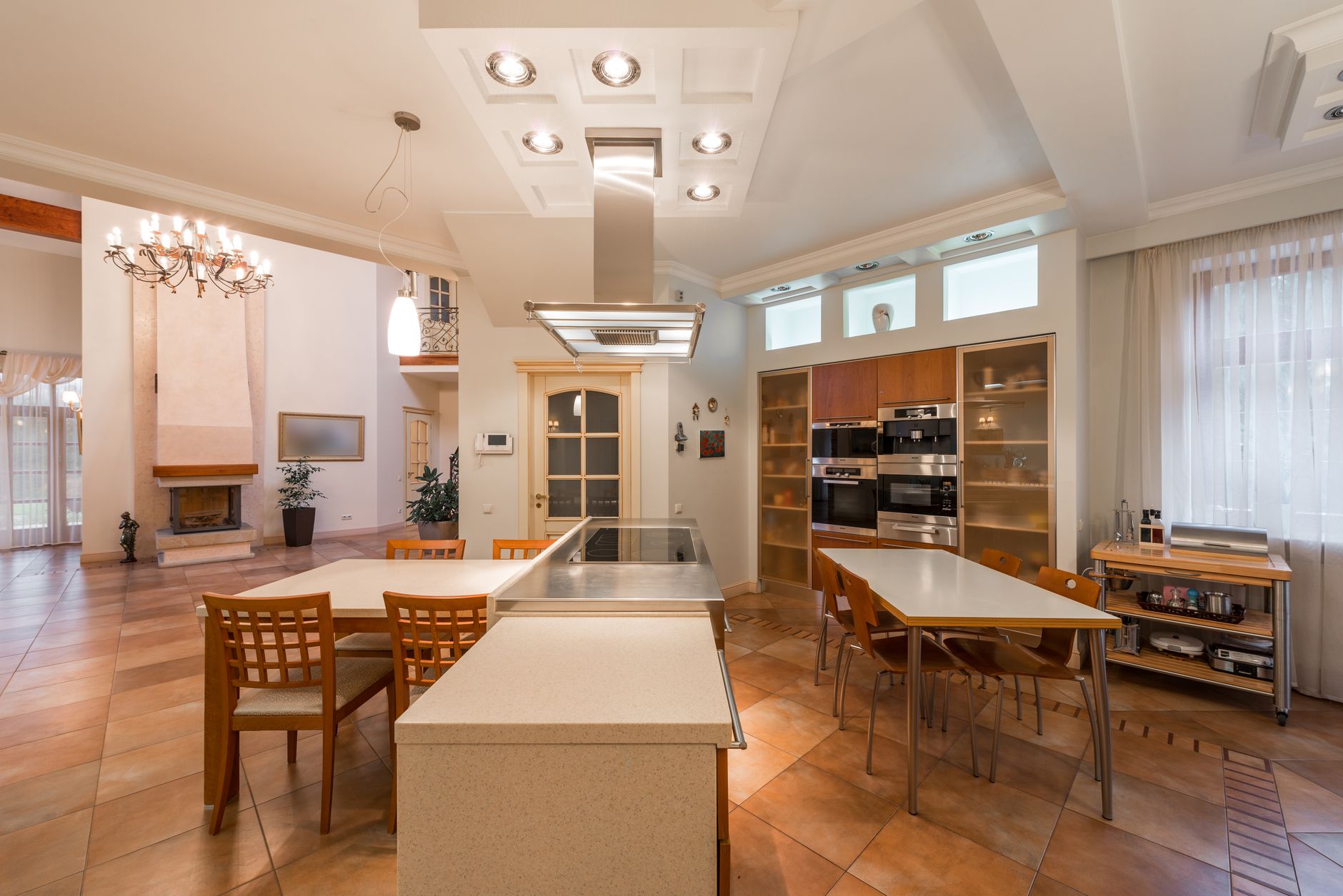
Choosing paint colours for an open-plan kitchen and dining area is genuinely harder than choosing for a single-purpose room. You're not picking one colour for one mood. You're picking a palette that holds a food-prep zone and a social eating zone together without making either feel wrong. Get the balance right and the space feels unified. Get it wrong and the kitchen looks like it belongs in a different house from the dining area it opens onto.
Why open-plan colour is a different problem
A single room has one dominant light source, one primary function, and one visual anchor point. An open-plan kitchen and dining area has all three of those things doubled. Light hits the two zones at different angles, especially in Melbourne homes where north-facing kitchens often receive direct sun while the adjacent dining area stays in softer, cooler light for most of the day. A colour that looks warm and inviting in the kitchen can appear flat or cold two metres away at the dining table.
There's also the cabinetry problem. Kitchen cabinetry introduces a fixed tone that you can't repaint every few years the way you can a wall. If the cabinets are white, warm neutrals on the walls usually work. If they're a mid-tone timber veneer, a warm greige or soft clay reads well. If they're a deep navy or charcoal, you have more freedom, but you need to make sure the dining area walls don't fight with that mass of dark colour by going too pale or too saturated.
Start with the connection, not the zones
The most reliable method is to choose the connecting element first. In most open-plan layouts, that element is the ceiling or the flooring, because both run through both zones without interruption. Paint the ceiling a consistent colour throughout, even if the walls shift slightly between areas. A single ceiling tone acts as a visual anchor that stops two zones from reading as separate rooms.
From there, pick one base wall colour that works in both spaces. It doesn't have to be the only colour on every wall, but it should appear in both zones so the eye has somewhere to rest. A soft warm white like Dulux Antique White USA or a muted clay tone can do this across a wide range of cabinetry styles.
Once you have your base, you can introduce a secondary colour as an accent. The island bench or the wall behind the dining table are the two most common places to do this. Both are focal points that draw attention, and applying a deeper or contrasting tone there gives each zone its own character without breaking the connection. This is essentially the same logic behind picking the right accent wall colour: one deliberate contrast point, not several competing ones.
Tones that hold across both zones
Not every colour family works across the functional demands of a kitchen and dining area. Here's what tends to succeed and why.
- Warm neutrals (greige, clay, soft ochre): These read well under both task lighting in the kitchen and ambient dining light. They're forgiving of the yellow tones that overhead kitchen lights cast, and they make timber furniture and natural-fibre dining chairs look intentional rather than mismatched.
- Muted greens (sage, eucalyptus, soft olive): Popular in Australian homes right now, and for good reason. These tones sit in the middle of the warm-cool spectrum, which means they perform consistently across different light conditions. They also reference the natural world without demanding that the whole room follow a botanical theme.
- Deep blues or navy (used as an accent only): A navy island or a dark dining feature wall can add genuine drama, but only when the surrounding walls are pale enough to give the colour room to breathe. If the base walls are also mid-dark, the space starts to feel heavy.
Colour psychology matters more in eating spaces
The dining area in particular benefits from colour choices grounded in how hues affect mood. Reds and oranges famously stimulate appetite, but in a domestic setting they can also feel overwhelming over a long meal. Softer warm tones, particularly terracotta, dusty rose, and amber, create the same appetite-friendly warmth without the aggression. The kitchen, by contrast, benefits from colours that feel clean and slightly energising because it's a workspace. This is why the classic move of a white or very pale kitchen with a warmer dining area actually has a practical logic behind it, not just an aesthetic one. For a deeper look at how specific hues influence behaviour and comfort, the principles of colour psychology and mood at home apply directly to eating and entertaining spaces.
Testing colours across both zones before committing
Always test paint in both areas before purchasing full quantities. Paint a 30cm x 30cm swatch on the kitchen wall nearest the dining area and an identical swatch on the dining wall nearest the kitchen. Live with them for at least 48 hours, checking morning light, afternoon light, and evening artificial light. The colours will read differently at each check. What you're looking for isn't a colour that looks perfect at noon. You want a colour that holds together across the whole day without jarring.
Apex Painting recommends testing at least 3 shortlisted colours side by side rather than testing one at a time. Seeing them next to each other on the same wall surface is far more informative than remembering what last week's swatch looked like.
Where the two-colour approach works well
Some open-plan kitchens and dining areas have a natural break point: a half-wall, a change in flooring material, or a ceiling bulkhead that separates the two zones. Where a genuine architectural break exists, a two-colour approach can work well. The kitchen takes one tone, the dining area takes a closely related second tone, and the transition sits at the break point rather than mid-wall. The key is keeping the two colours within the same family (same undertone, similar saturation). A warm sage kitchen paired with a deeper sage-green dining area reads as intentional. The same warm sage kitchen paired with a cool teal dining area reads as a mismatch. If you're working with two distinct tones across a shared space, the technique for painting a room with two colours without it looking patchy covers the cutting-in and transition methods that keep the result looking deliberate.
One thing to avoid
The most common mistake Apex Painting sees in open-plan kitchen and dining spaces is choosing the kitchen colour and the dining colour independently, without holding them next to each other first. People pick a kitchen colour based on the cabinetry, then pick a dining colour based on the furniture. Each choice looks fine in isolation. Together, they can clash at the point where the two zones meet. Always make the two colour decisions together, with both cabinetry and furniture samples in the room at the same time.
Open-plan living asks a lot of a colour palette. The right approach is to treat the kitchen and dining area as a single visual system first, and two distinct zones second.