
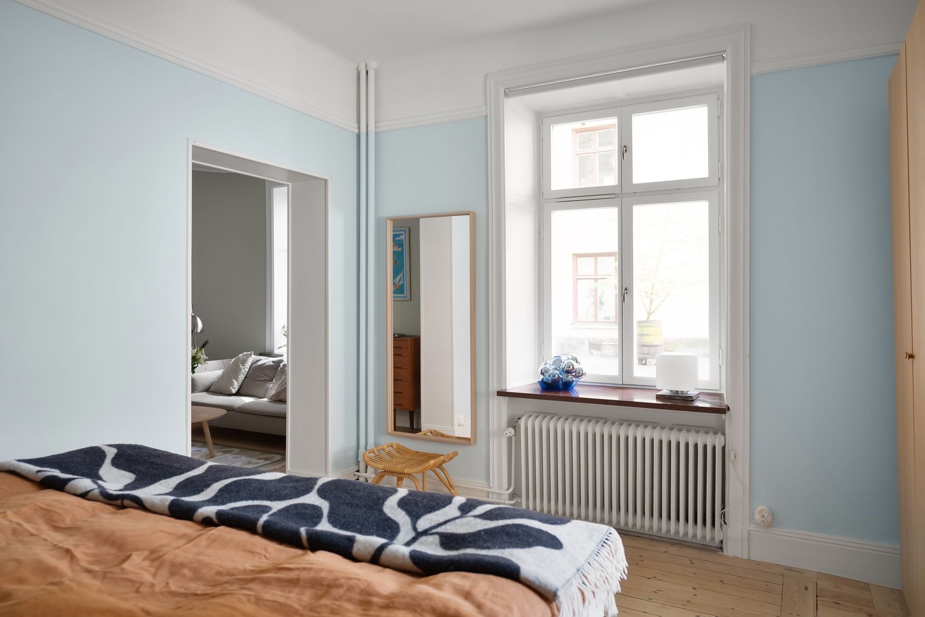
Most people choose bedroom colours the way they choose curtains: by feel, by trend, or by whatever looked good in the store. Sleep quality rarely enters the conversation. But colour psychology research shows that the hues on your bedroom walls directly influence heart rate, cortisol levels and how quickly the brain winds down at night. Getting this right doesn't require an interior designer. It requires understanding what colours actually do to the nervous system, and which finishes make them work harder.
Why bedroom colour matters more than any other room
The bedroom is the one room where your eyes close and your nervous system shifts gear. Every other room in the house serves activity. The bedroom serves recovery. That distinction changes everything about how colour should function here.
Warm, stimulating hues, particularly high-chroma reds and bright oranges, elevate heart rate and increase alertness. That's useful in a kitchen. In a bedroom, it works against you. Cooler, lower-saturation colours do the opposite. They reduce perceived temperature, slow breathing rhythm and signal to the brain that the environment is safe and calm. This isn't placebo. The Sleep Foundation has documented how environmental colour cues interact with circadian rhythm regulation, with blue-adjacent tones consistently performing well in sleep environment studies.
Understanding how paint colours affect your mood at home is the foundation. Applying that knowledge specifically to sleep is a narrower, more practical problem.
The colours that consistently support sleep
Blue is the most researched colour for sleep environments, and the evidence holds. Soft, muted blues, think slate, dusty sky, or misty blue-grey, reduce heart rate and lower ambient temperature perception. The key word is muted. A saturated cobalt is stimulating. A chalky, slightly grey-washed blue is not.
Sage green performs almost as well. It sits at the cool end of the green spectrum and carries enough grey to avoid the vivid quality that makes lime green feel energetic. Sage reads as natural and grounded. It works particularly well in bedrooms with timber floors or natural fibre rugs, where the palette reinforces organic calm rather than competing with it.
Soft lavender is worth mentioning separately from purple in general. Deep, saturated purples carry a richness that can feel dramatic and stimulating. Pale lavender, the kind that sits closer to grey than to violet, functions more like a cool neutral. It's particularly effective in east-facing rooms that catch morning light, since the warmth of sunrise will shift the tone toward pink without making the room feel garish.
Warm neutrals in the right range also work well. Greige (grey-beige), pale stone, and oatmeal all provide low visual stimulation without the coldness of a grey-white. They suit people who find blue or green bedrooms too clinical. The risk with warm neutrals is going too yellow. Anything that reads as golden or buttery starts to feel energising rather than restful.
Colours to avoid in a sleep environment
Red is the clearest one to avoid. Any red, including terracotta and rust, increases alertness. These are excellent choices in living spaces. In a bedroom they extend the time it takes to wind down. Even a deep burgundy accent wall, which might look sophisticated, carries enough chromatic intensity to keep the nervous system partially activated.
Bright yellow is similarly problematic. Yellow stimulates the production of serotonin, which keeps you alert and in a good mood. Useful in a kitchen or home office. Not what you want at 10pm.
Pure white and very cool grey are less obviously problematic but worth questioning. They don't stimulate the nervous system the way red does, but they lack the warmth and softness that make a bedroom feel genuinely restful. Stark white can also increase light reflection to a degree that makes the room feel bright and clinical, particularly if there's a streetlight outside. White bedrooms work when the light conditions are carefully managed. Without that control, they tend to feel like they belong in a hospital rather than a home.
Saturation and finish: the details that decide it
The right hue in the wrong saturation is still the wrong choice. Saturation refers to the intensity of the colour. A low-saturation, muted blue is calming. The same blue at full saturation is energising. When selecting a bedroom colour, always test it at the darkest point of the day, not just in the store or in daylight. A colour that looks pale and quiet at noon can read very differently under evening artificial light.
Finish matters too. High-gloss and semi-gloss sheens bounce light around the room and increase visual stimulation. For bedrooms, a low-sheen matte or eggshell finish absorbs rather than reflects. The wall reads as quieter, which is exactly what a sleep environment needs. If you want guidance on matching finishes to the room function, the principles in choosing the right paint finish for every room apply directly here.
Ceiling colour: the most overlooked decision
The ceiling is the largest surface a person lying in bed actually looks at. Most bedrooms have it painted white by default and never revisit that choice. A ceiling painted slightly darker than the walls, or in a soft complementary tone, creates a sense of enclosure that the brain interprets as shelter. That feels, literally, easier to fall asleep in.
Try painting the ceiling in the same hue as the walls but two shades deeper. The room doesn't get darker in a negative sense. It gets cosier. This technique works especially well with sage green, soft blue and warm neutrals. Avoid it with very deep colours on the walls, where a darker ceiling can tip the room into feeling oppressive rather than enveloping.
Practical steps for choosing and testing your colour
Don't select from a chip. Paint at least two A3-sized swatches on the actual wall, in different corners of the room. Live with them for three days. Check them in the morning when the room is brightest, in the late afternoon, and at night under your actual lighting. The colour that passes all three conditions is the one worth committing to.
If the bedroom is south-facing and receives direct, intense sunlight during the day, that changes how any cool colour reads. A pale blue can become almost white in strong light. In that situation, going one to two shades deeper than your instinct gives the colour the staying power it needs. The guidance on choosing paint colours for a south-facing room covers this in detail and is worth reading before finalising any bedroom palette.
Apex Painting handles bedroom colour consultations as part of residential painting projects across Melbourne. Selecting the right colour is only half the work. Applying it with consistent coverage and a finish that sits flat and matte on the wall is what turns a good choice into a great result.