
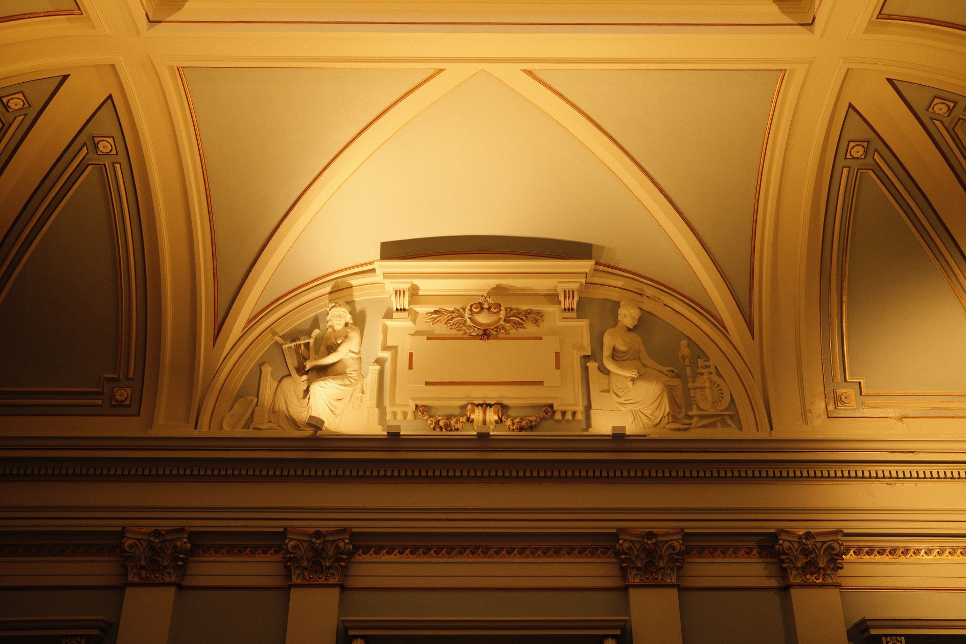
Cornices, ceiling roses, exposed timber beams, arched doorways, dado rails, picture rails and decorative columns all have one thing in common: paint applied without intention makes them disappear. Highlighting architectural features with paint isn't a specialist skill. It's a matter of understanding contrast, sheen and colour temperature, then applying that understanding deliberately.
Why most architectural details go unnoticed
When a cornice, ceiling rose or architrave is painted the same flat white as the wall beside it, the eye has no reason to stop. There's no tonal contrast, no sheen difference and no visual boundary to follow. The detail is technically present, but it reads as texture rather than feature.
The opposite problem happens with over-treatment. Painting every detail in a bold accent colour fragments the room. The eye doesn't know where to rest. Done well, paint emphasis is selective: one or two elements per room, chosen because they're genuinely worth attention.
Contrast is the core tool
Contrast between a detail and its surrounding surface is what makes it register. That contrast can be tonal (light versus dark), temperature-based (warm versus cool), or sheen-based (gloss against matte). You don't need all three. One is usually enough.
A deep charcoal cornice against a pale warm-white ceiling is a classic Melbourne approach that works in period homes without looking theatrical. A ceiling rose picked out in semi-gloss against a flat ceiling catches light differently and reads as deliberate even when the colour difference is subtle. Exposed timber beams in a natural finish already provide contrast through material; painting them in a tone 20 to 30 percent deeper than the ceiling reinforces that contrast without masking the timber character.
Understanding the relationship between warm and cool tones is worth getting right before you commit. A warm ceiling with a cool-toned cornice can look disconnected rather than considered. If you're working with warm vs cool paint colours, the same tonal logic applies to architectural details as it does to full wall choices.
Sheen levels: the underused variable
Most homeowners reach for colour contrast first, but sheen contrast is quieter and often more elegant. A feature cornice in a semi-gloss finish against a matte ceiling in the exact same white creates a clear visual hierarchy. In morning or afternoon light, the semi-gloss picks up the light source and traces the cornice line without any colour drama at all.
This approach suits period homes where adding a second colour to trim feels too busy, and it suits rental properties where the owner wants polish without a bold commitment. Ceiling roses respond particularly well to a gloss or semi-gloss treatment: the curvature of the moulding creates its own shadow play when the sheen is right.
For skirting boards and architraves, a low-sheen enamel against a flat wall paint is the standard Melbourne approach, and it works precisely because of that sheen step-up. If you're painting a hallway and want the joinery to read as refined rather than functional, the sheen level is doing more work than the colour.
Feature by feature: what to do with each detail
Different architectural elements respond to different treatments. Here's how to think about the most common ones:
- Cornices and ceiling roses: Try a tone one or two shades deeper than the ceiling, or step up to semi-gloss. In rooms with high ceilings, a deeper cornice draws the eye upward and makes the room feel taller rather than more enclosed.
- Dado rails and picture rails: These work well when treated as a dividing line between two tones. The wall below the dado can be slightly deeper than the wall above it, with the rail itself in a gloss or semi-gloss that separates the two zones cleanly.
- Exposed timber beams: Don't paint them the same tone as the ceiling unless your goal is to make them recede. A natural oil or a deep charcoal stain against a white ceiling gives the beam structure. If the beam is already painted, a tone two shades deeper than the surrounding surface restores its presence.
- Arched doorways and window reveals: The reveal (the inner face of the arch) is often left the same colour as the wall, which wastes an opportunity. A deeper tone on the reveal creates depth and makes the arch read as a genuine portal rather than a decorative edge.
- Columns and pillars: In residential settings, columns are often painted identical to the surrounding wall or ceiling, making them read as structural rather than architectural. A consistent tone slightly cooler or warmer than the wall can give a column a sculptural quality without drawing excessive attention.
Colour temperature and period homes
Melbourne has a high concentration of Victorian, Edwardian and interwar homes, many of which have original cornices, ceiling roses and decorative joinery. These homes respond well to period-appropriate palettes: warm creams, deep greens, terracotta and muted blues.
In a Victorian terrace, painting the cornice in a soft sage or dusty blue against a warm white ceiling is historically coherent and visually strong. In an interwar bungalow, cream-on-cream with a sheen step-up is often the right call: these homes have simpler moulding profiles that can look fussy if over-coloured.
Colour psychology plays a genuine role here. A deep olive cornice in a bedroom reads as grounding and restful. The same treatment in a study can feel focused. If you're selecting tones for a space where mood matters, the principles behind how paint colours affect your mood at home apply just as directly to architectural details as they do to whole walls.
When to use a feature wall alongside architectural emphasis
A feature wall and highlighted architectural details can coexist, but they need to be on the same side of the room. Placing a dark feature wall on one side and a treated cornice on another creates visual competition. The stronger move is to run the feature wall behind or adjacent to the architectural element, so the two reinforce each other rather than fight.
A bay window, for example, makes a natural feature wall candidate. Paint the wall within the bay one tone deeper, treat the window reveal in a semi-gloss that matches the joinery, and the entire bay reads as a deliberate composition rather than a collection of separate decisions.
Preparation determines the outcome
Highlighted architectural features expose flaws that flat, even-colour schemes would hide. A ceiling rose painted in gloss will show every crack, brush mark and uneven edge. So preparation isn't optional: it's the condition on which the entire effect depends.
Fill any hairline cracks with an appropriate flexible filler. Sand back any previously built-up paint on cornice edges. On older joinery with multiple layers, a light sand before painting is the difference between a crisp line and a smeared one. Disguising architectural flaws with paint is a separate skill set from highlighting features: you need to know which approach suits each detail before you open a tin.
Apply with a quality brush on detailed moulding. A cheap brush leaves bristle marks in gloss finishes that show clearly under raking light. On ceiling roses, a 50mm or 63mm angled sash brush gives control in the recessed areas without dragging excess paint across the raised sections.
Apex Painting brings precision to architectural detail
Apex Painting delivers residential painting services across Melbourne with particular attention to heritage joinery, period moulding and detailed interior work. Apex Painting handles colour selection, surface preparation and application on everything from Victorian ceiling roses to contemporary arched reveals, producing finishes that hold up and look deliberate.
Contact Apex Painting to discuss how your home's architectural details can be brought forward rather than painted over.