
Most homes have at least one architectural flaw the previous owner never got around to fixing: a wall that bows slightly in the middle, a ceiling that drops a few centimetres on one side, a column that sits awkwardly off-centre, or a doorway that doesn't quite align with the room's axis. Before calling a builder, it's worth knowing how much paint alone can accomplish. With the right colour choices and finish strategy, Apex Painting regularly helps Melbourne homeowners make structural imperfections far less visible, sometimes invisible altogether.
Why finish matters more than colour for hiding flaws
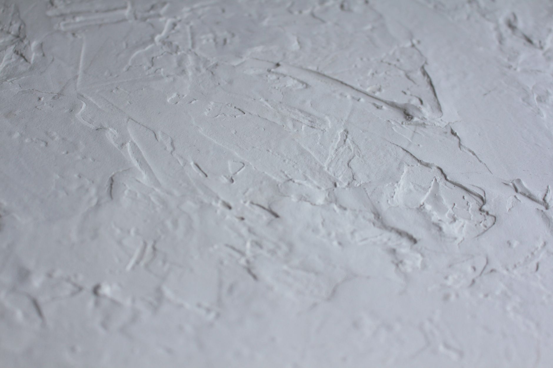
Colour gets all the attention, but sheen level is what actually reveals or conceals surface texture. A flat or matte finish scatters light rather than reflecting it, which means dents, ridges and uneven patches don't catch the eye the way they would under a semi-gloss. On walls with minor plaster imperfections or patched repairs, a low-sheen paint in the 15–25% gloss range is the most practical choice. The texture reads as depth rather than damage.
Conversely, applying a high-gloss finish to a wall that isn't perfectly smooth is one of the most reliable ways to make every flaw glaringly obvious. Light reflects off the surface at a consistent angle, and anything that breaks the plane becomes a shadow. Reserve high-gloss coatings for genuinely smooth surfaces: new joinery, doors and window frames where the prep work has been thorough.
Colour strategies for specific structural problems
Uneven or bowed walls
A bowed wall catches raking light and creates a visible shadow line. Painting it the same colour as the ceiling and adjacent wall removes the tonal contrast that makes the bow noticeable. Mid-tone colours in the warm beige and greige range work particularly well because they don't create strong contrast with shadows. Avoid very pale whites on walls you know are uneven: white amplifies shadows rather than absorbing them.
Pipes, ducts and structural columns
Exposed pipes and box-in columns read as eyesores when painted a contrasting colour. Paint them the same colour as the wall they sit against and they recede visually. This works best when the surrounding wall is a mid-tone or deeper shade. If the wall is a very pale neutral, choose a colour two or three shades darker for the wall itself, then match the pipe to that deeper tone. The column or pipe becomes part of the wall rather than an object in front of it.
Off-centre windows and asymmetrical openings
When a window sits noticeably off-centre in a wall, the temptation is to hang curtains wide to compensate. Paint can help from the other direction. A deeper colour on the wall where the window sits draws the eye toward the opening rather than to the gap beside it. Feature wall treatment on the window wall shifts attention to the window itself, making its position feel deliberate. For advice on how to use paint to visually resize an awkward room, the principles overlap significantly: both problems respond to redirecting where the eye lands.
Low or sloped ceilings
A ceiling that feels low compresses the room. Painting it a shade or two lighter than the walls creates a contrast that lifts the perceived height. Taking the wall colour slightly higher than the cornice line, or eliminating the cornice colour distinction entirely by painting walls and ceiling the same very pale tone, both reduce the visual compression. Vertical stripe treatments on the walls, even very subtle tone-on-tone stripes achieved with matte and satin finishes, pull the eye upward and add apparent height without structural work.
How trim colour masks alignment problems
Skirting boards, architraves and cornices that aren't level are harder to fix than they sound. Replastering and realigning them can cost thousands. Paint gives you a workaround. Painting trim in a colour close to the wall, rather than in a contrasting white or off-white, reduces the visual line that highlights misalignment. A wall painted in a warm stone tone with matching warm-stone trim reads as a cohesive surface; any slight variation in the architrave height is far less noticeable than it would be against a crisp white surround.
This is the opposite of the traditional approach, where white trim is treated as a given. It's a legitimate design choice in its own right, not a workaround, and it suits the muted, layered palettes that are popular in Melbourne interiors right now. If you're unsure how trim colour interacts with the walls in your specific space, the same principles covered in choosing between warm and cool paint colours apply: the tonal relationship between trim and wall determines whether the boundary between them reads as sharp or soft.
When to match and when to contrast
The general rule is: match to hide, contrast to draw attention. Matching a problem surface to its surroundings removes the visual boundary that makes the flaw readable. Contrasting creates a focal point, which is only useful when you're directing attention away from something else entirely.
A practical example: if a room has an ugly support column near the centre and a genuinely lovely original fireplace on the opposite wall, painting the column to match the wall and giving the fireplace a contrasting feature treatment achieves two things at once. The eye goes to the fireplace. The column disappears into the background. The same logic applies to any room where one element is worth showcasing and another is worth hiding.
Preparing flawed surfaces properly before painting
Paint can conceal a lot, but it won't bridge a crack that's still moving, fill a deep gouge or hide bubbling caused by moisture. Surface preparation is the non-negotiable step before any disguise strategy works. Fill static cracks with a flexible gap filler, sand back raised edges on repaired patches, and apply a quality primer before the top coat. Skipping primer on a patched area is one of the main reasons repaired spots show through paint: the patch absorbs the top coat differently than the surrounding plaster, leaving a flat "dead" spot that catches light differently.
For walls with more significant damage behind the paint, it's worth reading about how to handle paint failure on rendered walls after patching before starting. Getting the substrate right is what makes the colour and finish strategy work.
What Apex Painting recommends for older Melbourne homes
Melbourne's older housing stock, particularly the Federation and Edwardian era homes in suburbs like Fitzroy, Northcote and Brunswick, often has plaster walls that have shifted, settled and been repaired piecemeal over decades. Apex Painting approaches these surfaces by assessing the severity of each imperfection, recommending a sheen level suited to the wall condition, and choosing a colour palette that works with the room's orientation and natural light rather than against it. The goal is a finish that looks considered, not one that's compensating for something.
Paint isn't a substitute for structural repairs where those are genuinely needed. But for the everyday imperfections that most homes carry, a well-planned paint strategy handles far more than most homeowners expect.