
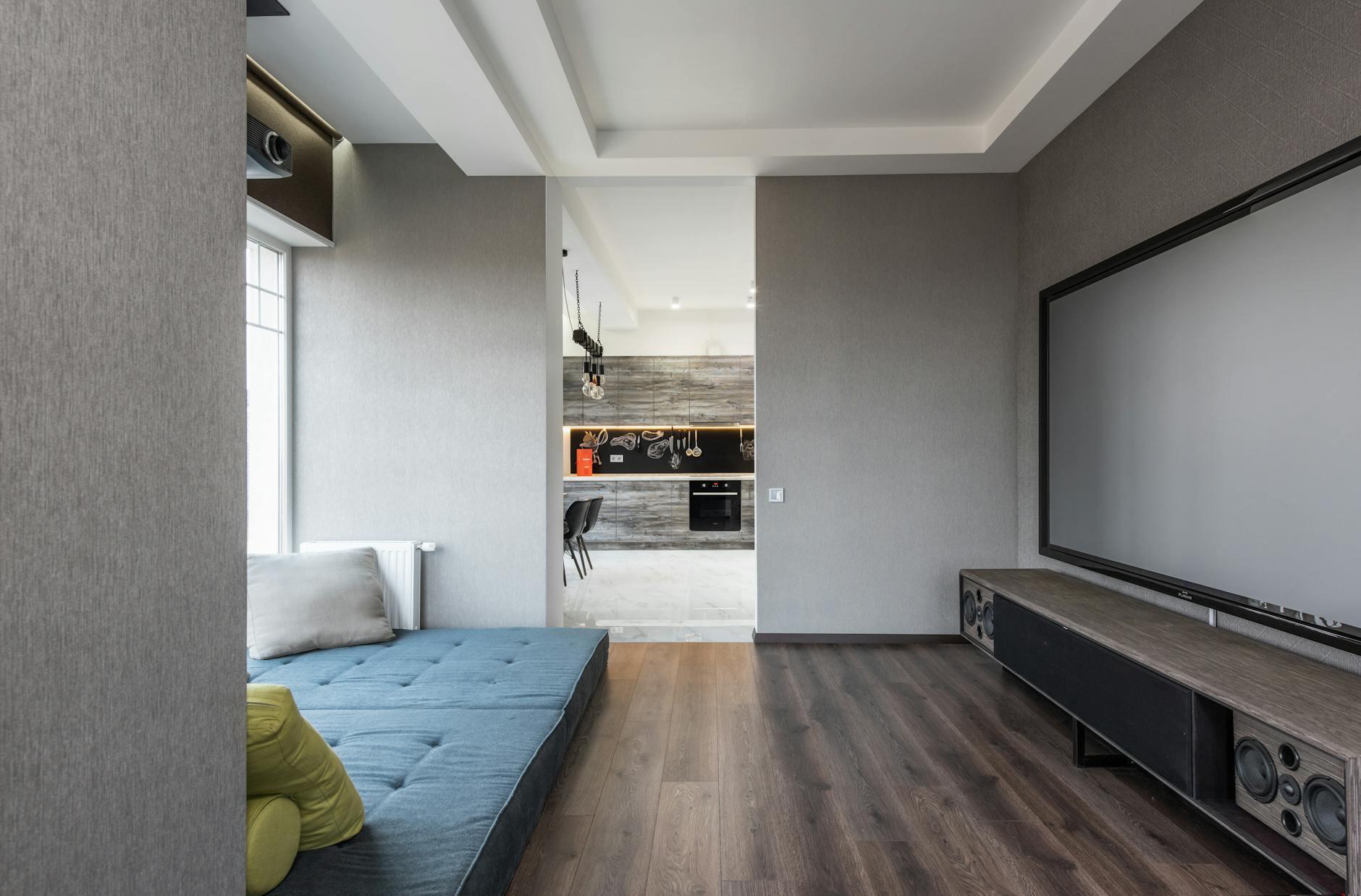
Open plan living works beautifully until it doesn't. When a kitchen, dining area and lounge all flow into each other without any visual break, the result is a space that feels busy rather than airy, cluttered rather than considered. The good news is you don't need a wall or a partition to fix it. Paint is one of the most practical and affordable ways to zone an open plan layout, and when it's done well, it looks intentional rather than corrective.
Why zoning matters in open plan homes
Open plan living became the default in Australian new builds and renovations from the early 2000s onward, prized for its connection to light and social flow. The downside is that without visual anchors, the eye doesn't know where to settle. Distinct zones give each area a purpose, and that sense of purpose translates directly into how comfortable the space feels to use.
Paint creates zoning through two mechanisms: colour contrast and tone shift. A bold contrast draws a hard boundary between spaces. A subtle tone shift achieves something softer, guiding the eye without breaking the room's continuity. Both work. The right choice depends on the layout, the light, and how much separation you actually want.
Start with the architecture, not the palette
Before picking colours, read the room. Look at where the natural light enters, which surfaces carry the most visual weight, and where the functional zones already want to sit. A kitchen island, a change in flooring material, or a dropped ceiling panel all suggest natural dividing lines. Paint works best when it follows those cues rather than fights them.
Identify three zones at most in a typical open plan space: a cooking and prep zone, an eating zone, and a relaxing zone. Trying to paint five distinct areas in a single room almost always reads as chaotic. Restraint here is not a limitation. It's a design decision.
How to use colour to define each zone
The most reliable technique is to paint one feature wall in each zone a distinct colour while keeping the adjacent walls in a shared neutral. This creates visual anchors without making the space feel fractured. The neutral ties everything together; the accent colours do the differentiating.
For a lounge area, a deeper, warmer tone on the wall behind the sofa reads as a backdrop for relaxation. Something like a soft terracotta, a warm sage, or a muted charcoal all work well in Melbourne homes where the light tends to be bright but indirect. For the kitchen zone, cooler tones or a clean white on splashback-adjacent walls keep the space feeling clean and functional. The dining zone often needs the least intervention; a change in ceiling colour above the table is sometimes all it takes.
Understanding warm vs cool paint colours is genuinely useful here. Warm tones advance visually, making a wall feel closer and a space feel more intimate. Cool tones recede, which works well in zones you want to feel open and airy. Playing one against the other across a single open plan space can create the feeling of distinct rooms without a single partition going up.
Ceiling colour as an underused zoning tool
Most homeowners paint every ceiling the same white and stop thinking about it. In an open plan space, that's a missed opportunity. Painting the ceiling above a dining table in a contrasting or complementary colour creates a visual canopy effect. It draws the eye up, frames the zone, and creates an almost architectural sense of enclosure without walls.
It doesn't have to be dramatic. Even a ceiling two shades deeper than the walls achieves the effect. This technique works particularly well in homes with standard ceiling heights where more structural options aren't practical.
Half-wall and panel techniques
Two-tone walls, where the lower half is painted in a contrasting colour or tone, create a horizontal visual line that functions as a soft boundary. This works especially well between a living zone and a dining zone. Paint the lower 900–1100mm in a warmer or darker tone, and the upper portion and ceiling in the shared neutral. The effect is subtle from a distance but clearly defines each section when you're in it.
Painted panels (using tape to create rectangular blocks of colour on a wall) achieve a similar result with more control. They're a good option when you want to add interest without committing to full wall coverage. The technique is particularly popular in children's areas within open plan family rooms, where a painted panel behind a reading nook signals a separate purpose without any built joinery required.
Choosing a finish that suits each zone
The sheen level you choose matters as much as the colour itself. In a kitchen zone, a semi-gloss or satin finish on walls makes cleaning easier and reflects light in a way that feels appropriately practical. In a lounge zone, a flat or low-sheen finish absorbs light, reduces glare, and contributes to the sense of comfort and warmth. These functional differences in finish also provide a subtle visual cue that reinforces the zoning even when the colours themselves are fairly similar.
For a full breakdown of how to match finishes to each functional space, choosing the right paint finish for every room is worth reading before you commit to a product.
Keeping the palette cohesive
The risk with multi-zone painting in open plan spaces is creating a look that feels patchy rather than planned. The safest way to prevent this is to select all your zone colours from the same tonal family. If you're working with earth tones, stay in that palette across all zones. A warm terracotta in the lounge, a muted olive in the dining area, and a sandy white in the kitchen all share the same warm undertone and read as a considered collection rather than random choices.
A three-colour maximum (plus one neutral) is a practical rule for most open plan spaces up to around 60–70 square metres. Larger spaces can carry more variation, but only if the architecture supports it with physical separators like columns or ceiling level changes.
When to call in a professional
Zoning with paint sounds straightforward until you're standing in the space with a brush trying to hold a straight line across a 4-metre wall where two colours meet. Cutting in cleanly where tones change, maintaining consistent sheen across large surfaces, and managing the sequence of zones so nothing bleeds into the next all take practice. Apex Painting handles residential repaints across Melbourne, including multi-zone open plan projects where the prep and sequencing are as important as the colour choices themselves.
If you're weighing up cost and scope before getting started, the home painting cost guide for Melbourne breaks down what to expect for interior repaint work by room type and surface area.