
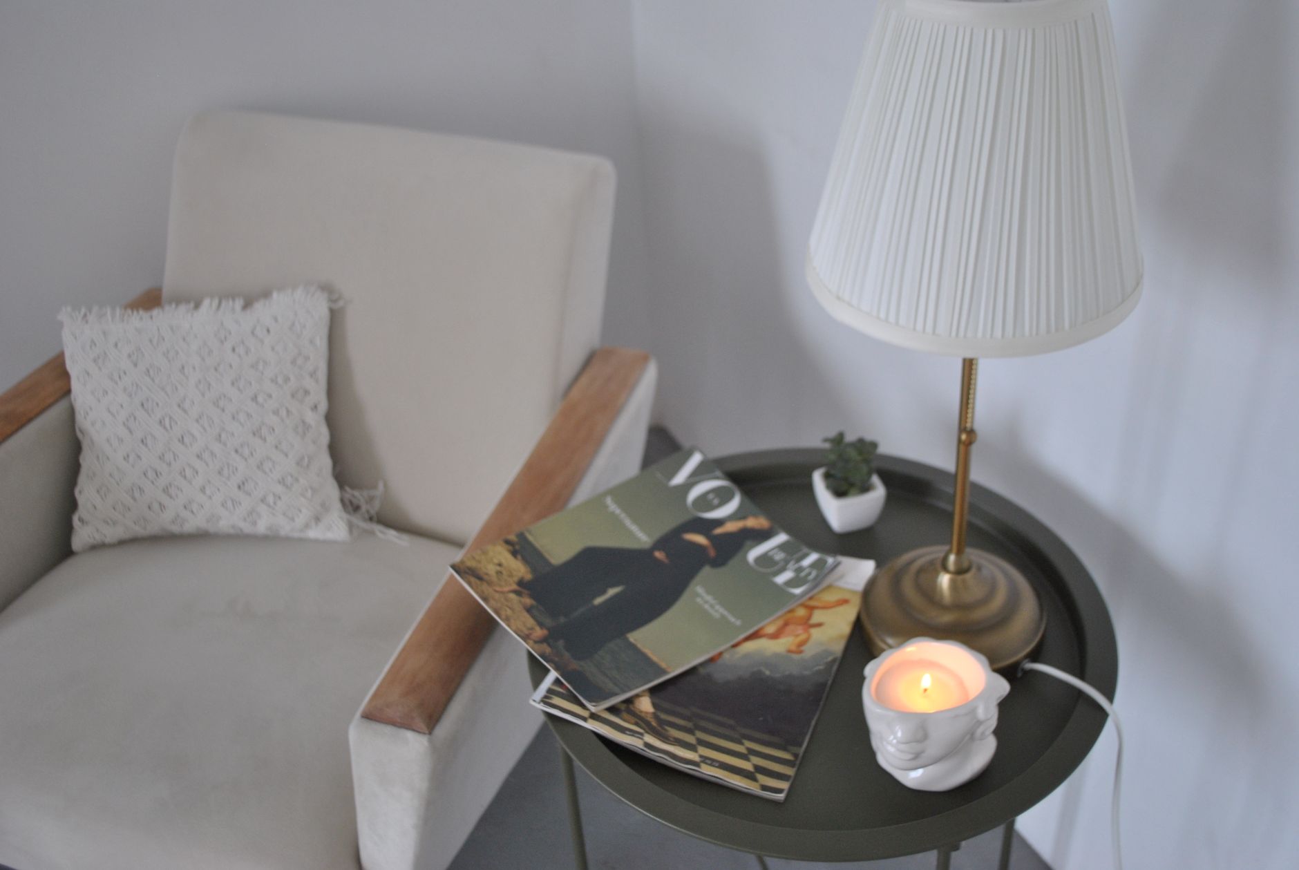
Paint colours for a study or reading nook carry more weight than people expect. These are spaces where you sit for long stretches, often under artificial light, and the walls are almost always in your peripheral vision. The wrong colour creates low-level visual noise you can't quite name. The right one disappears and lets you concentrate.
What a study or reading nook actually needs from paint
Most rooms have one job. A bedroom is for rest, a dining room is for gathering. A study or reading nook is different: it needs to support two distinct mental states, sharp focus when you're working and calm absorption when you're reading. Those two states don't need wildly different colours, but they do need colours that avoid stimulation. Bright reds, saturated oranges and high-contrast white-and-black pairings all push the nervous system toward alertness. That sounds useful for work, but it tips quickly into agitation rather than productive concentration.
The colours that hold up over a long sitting session are mid-depth neutrals, soft greens, muted dusty blues and warm off-whites. None of them demand attention. That's the point. Apex Painting finds that clients who repaint home offices and study nooks consistently choose colours from these families after their first attempt with something bolder didn't stick.
How light changes everything in a small enclosed space
Reading nooks in particular tend to be compact and often tucked into corners or under staircases, where natural light is limited. A colour that reads as a gentle sage green in a north-facing main bedroom can feel heavy and murky in a study alcove with one small window. Test any colour under both natural and artificial light before committing. Hold the chip up at the time of day you'll most commonly use the space.
For artificially lit studies, warm-toned bulbs (around 2700K to 3000K) shift paint colours noticeably toward yellow and amber. Cool LED task lighting (4000K and above) can make the same paint look grey or even slightly green. Choosing a paint colour without knowing your bulb temperature is one of the most common mistakes in this specific space. The article on choosing paint colours for a north-facing room that gets afternoon shade covers how diffuse, cooler light affects tone in ways that feel similar to enclosed study spaces.
The best colour families for focus and reading
There are four colour directions that consistently work well in studies and reading nooks. Each suits a slightly different personality and light condition.
- Warm off-whites and linen tones: These are the safest option for any light condition. They reflect enough light to keep a small space from feeling closed-in, without the sterile coldness of a bright white. Dulux produces a wide range in this category, including Antique White USA and Linen Wash, both of which photograph as neutral but read as warm in person.
- Soft, desaturated greens: Green is the colour the human eye processes with the least effort, which makes it genuinely useful in a space built for sustained concentration. Avoid anything with strong yellow or blue bias. The ideal is a sage or eucalyptus tone that sits comfortably between the two.
- Muted dusty blues: Cool in theory, but mid-depth dusty blues feel settled and calm rather than cold. They work particularly well in studies used primarily in the evening. Under warm light, they shift toward grey-blue, which is a pleasant result.
- Deep warm neutrals: For a reading nook specifically, a deeper tone on one or two walls creates a cocooning effect that many readers find genuinely useful. Charcoal-adjacent browns, deep terracotta neutrals and warm mushroom tones all work. The key is keeping them warm rather than cold-dark.
Accent walls in a study: when they help and when they don't
A single darker or bolder wall behind a desk can anchor the space and make it feel intentional rather than generic. Behind a reading chair, a deeper wall creates a backdrop that makes the seat feel like its own defined zone. The risk is choosing a colour that's interesting rather than liveable. A feature wall in a space you stare at for four hours straight needs to stay in the background of your attention, not the foreground.
The article on using dark paint colours without making a room feel small covers the specific techniques that keep a deep tone from closing a compact space in. The principles apply directly to study feature walls, particularly the guidance on keeping adjacent surfaces and trim lighter to preserve perceived room size.
Sheen and finish: don't overlook this in a study
Studies involve screens. Screens produce glare. A semi-gloss or satin finish on walls behind a monitor will reflect light directly into your eyes if there's any window or lamp behind you. Flat or low-sheen finishes on the main wall surfaces keep glare out of the picture. Reserve a higher sheen for trim and architraves, where durability matters more than light management. A flat paint on a feature wall behind a reading chair feels considered and intentional rather than unfinished.
One practical note on product: Dulux Wash&Wear in a low-sheen finish is a strong choice for a study because it handles the inevitable marks from chairs and bags while keeping the light-absorption properties of a flat paint. It's not as durable as a full satin, but in a study with moderate traffic it holds well.
Ceiling and trim colours in a reading nook
Low ceilings in compact reading nooks benefit from a ceiling painted one to two shades lighter than the walls rather than a stark white. A stark white ceiling above a warm mid-depth wall colour creates a hard contrast that draws the eye upward and makes the space feel less settled. A tone-matched lighter version of the wall colour keeps the nook feeling deliberately enclosed rather than accidentally cramped.
Trim colour follows the same logic. White trim against a soft sage or dusty blue wall looks crisp and clean. Against a very warm off-white wall, bright white trim can look jarring. In that case, matching the trim to the wall in a higher sheen gives definition without contrast that competes with the space's calm.
The room you're dividing from
Studies and reading nooks are often carved out of larger rooms or share a sightline with a hallway or living area. If the nook is visible from an adjacent space, the colour you choose needs to sit comfortably next to whatever's in that sightline. A jarring colour transition breaks the sense of considered design. Choosing a colour from the same tonal family as the adjacent room, even if it's a different hue, keeps the connection intact. A warm grey study nook visible from a warm-white living room reads as intentional. A saturated blue nook visible from that same space reads as an accident.
Getting paint colours to flow naturally from room to room is its own skill. The article on using paint to create visual flow between rooms covers this in detail, including how to manage tonal transitions where two rooms share a doorway or open wall.
A practical starting point
If you're stuck on where to begin, start with the function. Work-heavy study? Go soft green or warm off-white. Evening reading nook? A deeper warm neutral or dusty blue. Mixed use? A warm mid-tone sage handles both without compromise. Buy three test pots, paint 30-centimetre squares on the actual wall, and live with them for two full days before deciding. No chip card at a paint counter tells you what a colour does to a room's atmosphere at 9pm under lamp light. The wall does.