
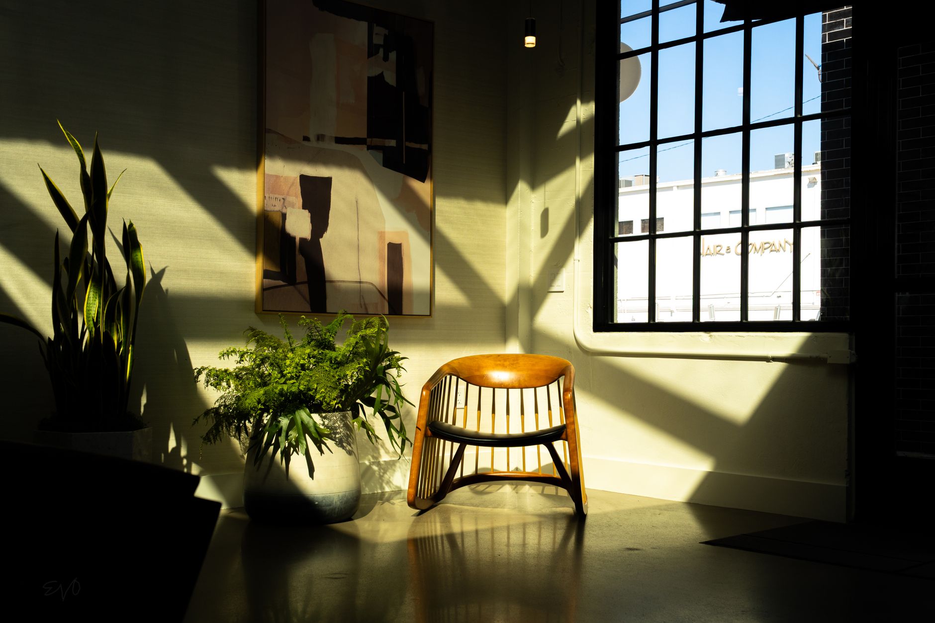
North-facing rooms in Australian homes are supposed to be the lucky ones. They catch morning sun, hold warmth through the cooler months, and generally get described as the bright, liveable spaces everyone wants. But a significant number of north-facing rooms are partially or fully shaded by late afternoon, either from neighbouring buildings, established trees, or the position of a neighbouring roof. When that shade arrives, the light quality shifts fast. Colours that looked warm and welcoming at midday can turn flat, greenish or downright cold by 3pm. Choosing paint colours for this kind of room requires a different approach to the standard north-facing advice.
Why afternoon shade changes everything
The light in a north-facing room shaded by afternoon isn't consistent across the day. Early morning brings cool, diffuse light. Midday delivers the clearest, most neutral light. By late afternoon, once direct sun is blocked, the room shifts to ambient reflected light, which carries a distinctly cooler, sometimes bluish cast depending on what's outside the window (sky, foliage, a rendered wall). That shift can be dramatic if your paint colour has any cool undertone at all.
Whites are the most vulnerable. A white with a subtle grey or blue undertone looks crisp in midday light and genuinely cold in afternoon shade. Even whites marketed as "warm" can tip cool once the direct sun is gone. The same logic applies to pale blues, soft greens, and any neutral sitting below 50 on a warm-to-cool spectrum. These colours work beautifully in rooms that hold consistent light. In a room where light quality shifts significantly across the day, they punish you in the hours when you're most likely to be home.
Understanding how warm and cool paint tones behave differently under changing light is the foundation of getting this right. It isn't about picking a colour you like; it's about picking one that performs across a range of light conditions.
Colours that hold up under reduced afternoon light
The colours that work best in afternoon-shaded north-facing rooms share a few characteristics. They carry warm or neutral undertones rather than cool ones, they have enough depth to read as intentional rather than washed out in low light, and they don't rely on direct sunlight to show their best face.
Terracotta-adjacent neutrals sit at the top of this list. Not full terracotta, which can overwhelm a room, but warm sandy tones with red or orange undertones. These colours stay visually warm when the ambient light drops. Dusky pinks and muted claeys behave similarly. They hold their warmth in shade rather than flipping to a cold tone.
Warm mid-tone greens, specifically those with yellow rather than blue as their base, can work well too. Think sage leaning olive rather than sage leaning mint. The yellow undertone keeps the colour grounded as afternoon light changes. Pale mint greens, by contrast, read as clinical in low light.
Ochres and warm yellows are genuinely good options for rooms that lose light early. They don't need direct sunlight to feel vibrant. Even at low light levels, a well-chosen warm yellow reads as energetic rather than flat. The risk here is undertone: yellows with green undertones can turn murky in shade. Stay with yellows that have orange in their base.
What to avoid in these rooms
Cool tones are the obvious ones to avoid, but the less obvious culprits are mid-tone whites and off-whites with grey undertones. These are among the most popular paint choices in Australian homes right now, and they're often sold as "warm whites," which can be misleading. A warm white is only warm relative to a cooler white. Once afternoon shade arrives, a grey-based off-white reads as flat stone rather than a warm neutral.
Pale blues and lavenders are equally risky. They can look elegant in rooms that hold steady light all day. In a room where afternoon shade creates a cooler ambient environment, they amplify that coolness and the space feels chilly even in summer.
Bright whites are best avoided entirely in these rooms. They depend on light to look bright, and without it they look stark. A room painted bright white in afternoon shade looks more like a basement than a sunlit interior.
Testing colours in this specific room
Testing paint colours before committing is always important. In an afternoon-shaded north-facing room, the testing process needs one extra step that most people skip: look at the sample at 3pm, not just at noon.
Paint a sample patch at least 30cm x 30cm directly on the wall. Look at it in the morning. Look at it at noon. Then look at it again at 3pm or 4pm when afternoon shade has settled in. The colour you see at that last viewing is the one you'll live with every evening. If it looks flat or cold at that time of day, it's the wrong colour regardless of how it performed in midday light.
Also look at the sample against the floor and any fixed furnishings in the room. Warm timber floors amplify warm paint tones beautifully. Concrete floors or cool-toned tiles can neutralise warm undertones partially, so you may need to push the warmth a little further in those rooms.
Ceiling and trim choices matter here
In rooms where light shifts noticeably across the day, the ceiling and trim colours contribute more than they normally would. A cool white ceiling in an afternoon-shaded room adds to the ambient coolness. A warm white ceiling reflects whatever ambient warmth is available back into the space. The difference isn't dramatic, but it's perceptible.
Trim painted in a warmer white than the ceiling creates a subtle hierarchy that helps. White with a slight cream or yellow tint on skirting boards and architraves warms the room without requiring you to change the wall colour. It's a small decision with a real effect, especially when the afternoon light drops. Getting skirting boards and architraves painted cleanly and in the right finish is what separates a considered paint job from a rushed one.
When the room has more than one issue
Afternoon-shaded north-facing rooms sometimes carry a second problem: they're not just low in afternoon light, they're also awkward in shape. A narrow room that loses light early is doubly challenging because cool, flat light makes narrow spaces feel more constricted. In that situation, pushing toward a lighter warm tone rather than a deeper one usually works better. You get the warmth without the visual weight. Using paint to visually resize an awkward room covers how colour and sheen interact to change perceived dimensions, which is worth reading alongside this.
Apex Painting handles colour consultation as part of residential painting projects across Melbourne. If you're unsure which direction to take in a room with complex light, getting a professional to assess the actual conditions before committing to a colour is a straightforward way to avoid an expensive mistake.