
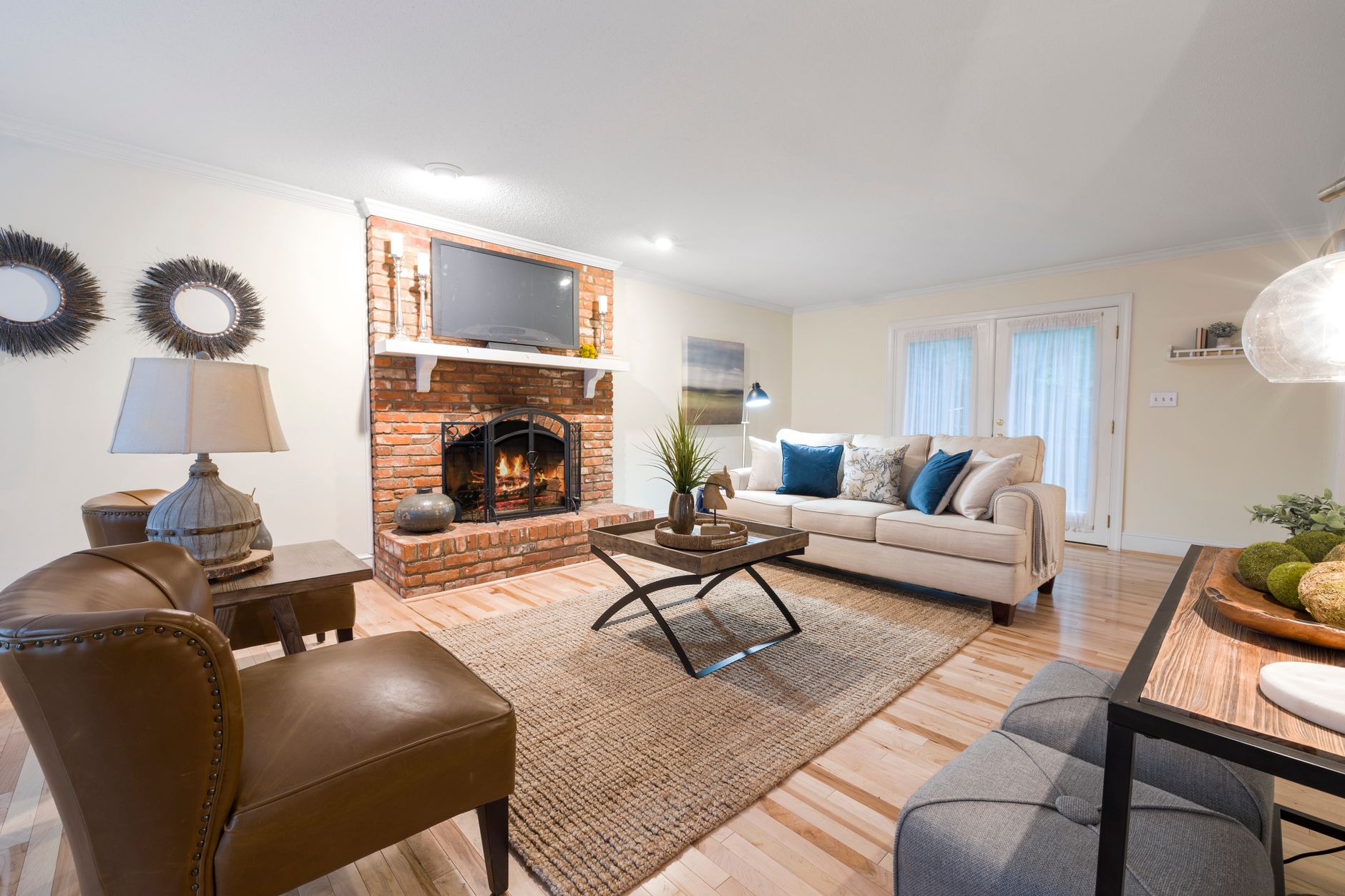
A room with a working fireplace has two completely different light environments. In the morning it's lit by daylight from windows. Come evening, it shifts to the amber glow of burning wood. Most paint colour advice assumes one consistent light source, which is exactly why living rooms with open fireplaces are so easy to colour badly.
Apex Painting works on a lot of Melbourne homes built before 1970, and those homes almost always have a fireplace as the room's focal point. Getting the paint colour right in these spaces takes a specific approach.
Why firelight changes everything
Firelight sits at around 1800 to 2000 Kelvin on the colour temperature scale. That's deeply warm and amber. For comparison, a north-facing room in daylight reads at roughly 5500 to 6500 Kelvin. The difference isn't subtle. A paint colour that looks like a clean sage green in the afternoon can pull yellow-gold and almost muddy by firelight. A muted blush that seems sophisticated at midday can look terracotta-orange at night.
The key principle: colours with blue or green undertones shift the most under firelight. Colours with warm, earthy or red undertones shift the least, because they're already in the same tonal neighbourhood as the light source.
Colours that work in both conditions
The safest territory for a fireplace room is warm neutrals with complex undertones. Think taupes with a red-brown base, warm whites with a yellow or cream undertone, and mid-toned ochres. These shades hold their character under firelight rather than fighting it.
Dulux's Antique White USA is a classic example: it looks clean and airy in daylight but shifts to a rich cream by firelight rather than going orange or sickly. Taubmans' range of warm beige tones, particularly those with a stone or buff base, behave similarly.
Deep colours also perform well, provided their undertone is right. A forest green with a yellow-green base turns brown-olive under firelight. A forest green with a blue base turns grey-black and can look flat. A forest green that sits closer to hunter or khaki tends to read beautifully by the fire because its earthy undertone complements the warmth rather than clashing with it. The same logic applies to navy: choose one with a slight warm cast rather than a pure cool blue.
Sheen choice matters more than usual
Fireplace rooms often have both high contrast (a dark mantle, pale walls, the bright fire itself) and relatively low ambient light. In that setting, a flat or low-sheen finish absorbs light and creates a cocooning effect. An eggshell finish adds a gentle luminosity without the harshness of a satin, making the room feel warm rather than clinical.
Avoid high-sheen finishes on the main walls. They'll catch the fire's movement and create distracting reflections. Reserve satin or semi-gloss for the skirting boards and architraves, where durability matters more than mood. If you'd like more guidance on matching sheen to function across different rooms, the guide to choosing the right paint finish for every room covers the trade-offs in detail.
The fireplace surround: treat it as a separate decision
The surround itself, whether brick, marble, timber or rendered plaster, is a colour anchor. It sits at the room's focal point and reads under the most intense light in the space. Painting the surround the same colour as the walls is a common choice when you want the fireplace to recede. Painting it in a deeper tone or a contrasting colour draws it forward and makes it the room's centrepiece.
If you have a brick surround and you're considering painting it, that's a separate preparation challenge from the colour choice. The process for painting a brick fireplace surround without flaking covers the prep steps and product selection specific to that surface, which gets important given the heat exposure.
Testing colours in fireplace rooms
The standard advice of testing a sample patch in natural light and at night applies here, but fireplace rooms need a third test: by actual firelight. Put your sample patches up, then light the fire on an evening and look at them when the room is lit only by the fire and maybe one or two lamps. This is the truest test of how the colour will perform in the room's most lived-in mode.
Test at least a 30cm x 30cm patch, not a 10cm square. Small samples are visually too easy to dismiss if they're slightly off. Large patches give a truer read of how the colour will feel at scale.
Ceiling colour in a fireplace room
Low ceilings are common in older Melbourne homes with original fireplaces, and the temptation is always to paint the ceiling white to lift the space. A flat white ceiling is fine, but a ceiling that picks up the warmest undertone from the wall colour will feel dramatically more cohesive by firelight. Try mixing the wall colour 10% into a white base for the ceiling. It's a technique that professional decorators use to unify a room without making the ceiling feel heavy.
If you're working with a room that has genuine architectural detail around the cornice or ceiling rose, keep the ceiling lighter than the walls regardless. The detail needs contrast to read properly. For colour decisions that stretch across multiple connected rooms, the article on using paint to create visual flow between rooms addresses how to carry a palette from the fireplace room through to adjacent spaces without the transitions feeling jarring.
Colours to avoid
Cool greys are the most common mistake in fireplace rooms. A grey with even a slight blue undertone will look dingy by firelight, no matter how sophisticated it looked on the sample card. Purple-based neutrals have the same problem. Cool lilac or lavender tones look genuinely strange under amber light.
Bright whites can also be tricky. A stark, blue-white ceiling or wall will look harsh and greenish next to warm firelight. If you want white in the room, choose a white with a genuine warm undertone. Dulux's whites and neutrals range labels the undertone on most products, which makes filtering for warm-based whites straightforward.
Pure black, used as an accent on the fireplace back panel or the mantle, does work beautifully. It creates depth, makes the fire itself look more dramatic, and it's already a near-neutral in firelight. It's one of the few cool-adjacent colours that holds its own in the warm light environment.
A practical starting point
If you're unsure where to begin, start with a warm white or off-white on the main walls and use the fireplace surround as the vehicle for a bolder colour decision. A painted mantle in a deep earthy green or a warm charcoal gives the room a strong focal point without committing the entire space to a colour that might not translate as well as expected under changing light.
Fireplace rooms are among the most rewarding spaces to colour well in an older home. Getting it right just requires accounting for what most colour advice ignores: the room has two lives, and the paint colour needs to work in both of them.