
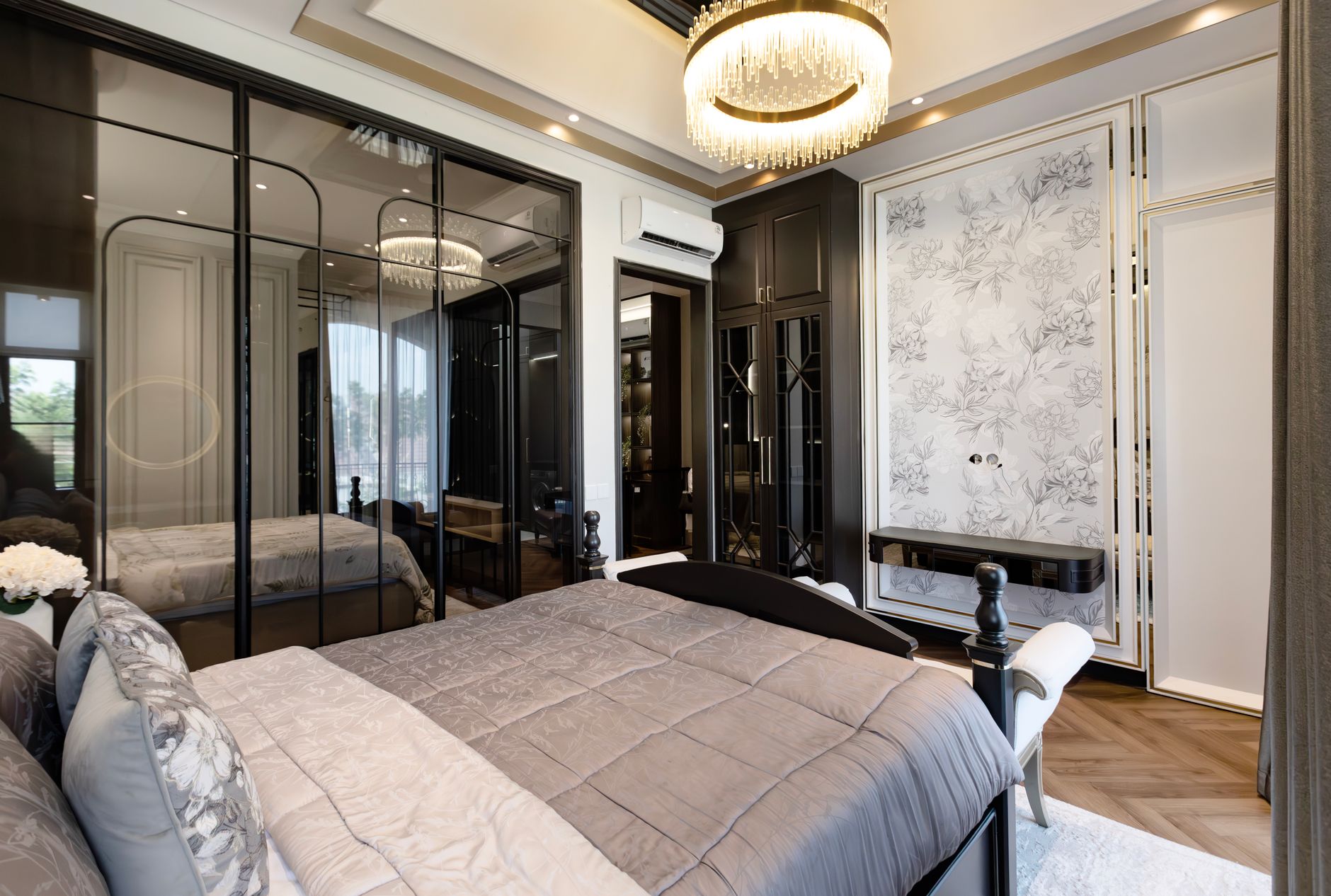
Choosing paint colours for a master bedroom is a different task to colouring any other room. You're not designing for guests, for productivity, or for street appeal. You're designing for rest, intimacy and the first and last thing you see each day. That context should shape every decision, from the warmth of the base tone to the sheen level on the walls.
Start with the light, not the paint chip
The single most common mistake people make when picking bedroom colours is choosing in the shop, under fluorescent light, then wondering why the paint looks wrong on the wall. Master bedrooms in Melbourne homes can face any orientation, and the direction your windows face determines which tones will hold and which will shift.
East-facing bedrooms receive cool, bright morning light that can wash out soft whites and pale blues, pushing them toward an almost clinical feel by 8 am. A warmer tone, such as a creamy white or a soft blush, gives the morning light something to work with rather than bleach out. For north-facing rooms that stay cooler and more diffuse through the day, deeper saturated tones can hold their richness without feeling flat. If your bedroom faces east and catches that sharp early light, it's worth testing your shortlisted colours at multiple times of day before committing.
West-facing master bedrooms face the hardest afternoon light in the house: intense, golden and highly directional. Warm earthy tones work beautifully here because the light amplifies rather than fights them. Cool greys and blue-greens, by contrast, can shift to a muddy or greenish cast as the sun comes in low.
Which colour families work best for rest
Colour psychology gives us a useful starting point. Cool hues, particularly soft blue-greens, muted sage, and desaturated lavenders, lower the perceived energy of a room. They're not calming because of superstition; they're calming because the eye processes short-wavelength colours with less physiological arousal. Cortisol response is measurably lower in blue-toned environments than in red or orange ones.
That said, "cool" doesn't have to mean cold. The best performing master bedroom colours right now sit in the warm-neutral-to-soft-cool range: dusty blush, warm taupe, aged white with a pink or green undertone, and deep sage. These tones feel grounded rather than sterile.
If you want to go darker, a deep forest green, charcoal, or smoked blue can make a master bedroom feel genuinely enveloping rather than just painted. The trick is saturation control. A dark colour that reads as mid-range in the tin often looks richer on four walls, so test it on a large sample board before ordering a full tin. For more on making dark tones work without shrinking a room, this guide on using dark paint colours covers the technique in detail.
Ceiling and trim colour decisions
Most master bedrooms default to white ceilings, and that's often the right call. A white ceiling reflects light back into the room and visually expands the space upward. But if the wall colour is already pale or warm-neutral, a ceiling in the same family, taken two shades lighter, can create a cocooned effect that suits a bedroom better than a stark contrast.
Trim colour is where a lot of master bedroom schemes fall apart. Bright white architraves and skirting boards against a dusty, muted wall colour create too much contrast and pull the eye to the edges rather than letting the room settle. Off-white trim, or even trim matched to the wall colour in a satin finish, keeps the room cohesive. It reads as considered rather than unfinished.
Finish and sheen level in a bedroom
Flat and low-sheen finishes are the right choice for bedroom walls in almost every situation. They absorb light rather than bouncing it, which reduces visual noise and makes the room feel quieter. Low-sheen also hides minor surface imperfections, which matters on older plaster walls that aren't perfectly smooth.
Reserve semi-gloss for the door, architraves and skirting boards only. A satin or semi-gloss wall in a bedroom looks fine in a showroom photograph and noticeably harsh in person, because the human eye picks up reflective inconsistencies across a large surface area in changing light.
If you're unsure which finish suits the rest of your home, understanding the interplay between warm and cool tones is worth reading before you finalise both colour and finish, because the two interact more than most people expect.
Practical considerations specific to master bedrooms
Bedrooms accumulate moisture from breathing, particularly overnight in a closed room. In Melbourne winters, that moisture can sit on cooler wall surfaces and encourage early paint failure if the wrong product is used. Choose a washable low-sheen specifically formulated for interior living areas rather than a budget flat paint, which will show wear at pillow height within a year.
Furniture placement also affects how colour reads. A large timber bedhead against a dark wall will almost disappear, which can look intentional and elegant. The same bedhead against a pale backdrop becomes the focal point. Neither outcome is wrong, but it's worth considering the furniture as part of the palette before settling on a wall colour.
Finally, test on the wall, not on paper. Buy two or three sample pots, paint A4-sized patches directly onto the wall in different corners of the room, and live with them for 48 hours. What looks right at midday often shifts considerably by evening light or under artificial lighting. This small investment protects against a much larger one.