
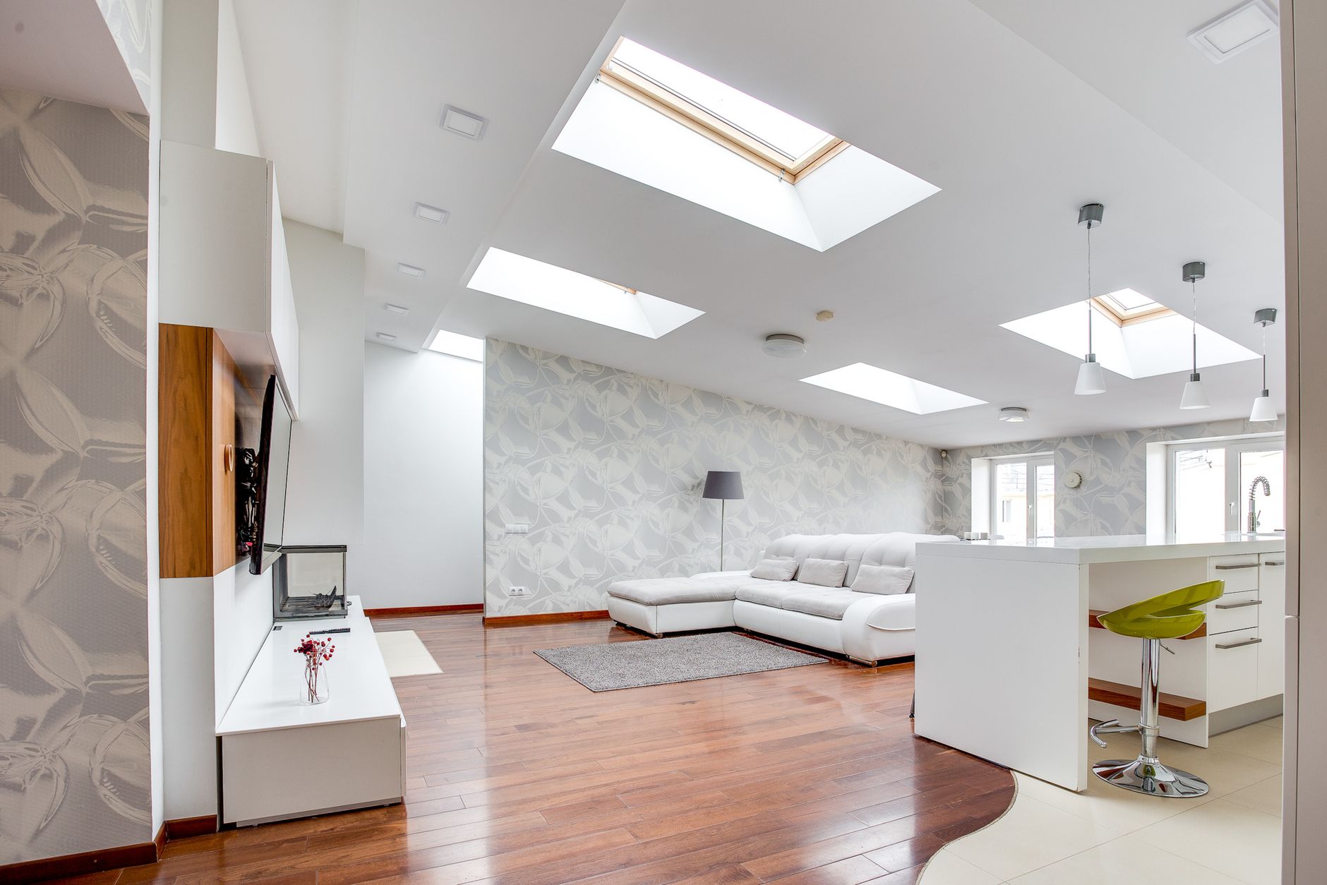
Skylights do something unusual to a room. They pour light directly downward, creating a brightness at the centre of a space that most wall-mounted windows don't produce. That sounds like a good problem to have. In practice, it makes colour selection genuinely difficult, because the same paint chip that looked warm and inviting in the hardware store can appear bleached, greenish or flat-out grey once a midday sun hits it from above. Getting the colour right in a skylit room takes a different approach.
Why skylights distort colour more than ordinary windows
A window on the wall throws angled, directional light that changes as the sun moves. A skylight throws light from above, perpendicular to most horizontal surfaces, which intensifies the reading of cool undertones and flattens warm ones. This is because the sky itself is the light source, and even on a sunny day the sky reads as blue-white, not yellow. That cool bias hits every surface below it, including your walls.
The effect is strongest between 10am and 2pm, when the sun is near its apex. In the morning and late afternoon, the skylight may pick up warmer tones as the angle of the sun shifts. This means a skylit room can cycle through three or four distinctly different colour moods in a single day. Paint colours with weak undertone definition tend to look muddy during those transitions.
Which undertones hold up best under skylight conditions
Colours with a clear warm undertone, think ochre, terracotta, soft amber and dusty rose, push back against the cool-white bias of skylight illumination. They don't neutralise it entirely, but they create a tension that reads as balanced rather than sterile. A pure warm white, one with a yellow or peachy base rather than a blue one, is particularly effective in kitchens and living areas where a skylit ceiling meets white-painted walls.
Avoid grey-beiges and greige tones unless they lean decisively warm. Skylights will pull the blue-green out of a neutral greige and make it look like a hospital corridor by midday. Similarly, cool whites with a blue or violet base will read almost clinical in direct overhead light. This is one case where the warm vs cool paint colour decision is not merely aesthetic. It directly determines how liveable the space feels for the majority of the day.
Rooms where this matters most
The impact of skylight illumination varies by room function. Consider these three situations separately.
- Living areas: A skylit lounge or open-plan kitchen-living space benefits from mid-range warm neutrals rather than pale ones. Pale colours in high-light rooms can create visual glare that makes it harder to relax. A shade with some depth, a warm linen or clay tone around 50–60% lightness value, absorbs enough light to stay comfortable.
- Bathrooms: Skylit bathrooms are tempting to paint brilliant white. The result is usually too bright. A stone-white or warm cream softens the intensity without losing the airy quality the skylight provides.
- Bedrooms: Overhead light in a bedroom can make sleep difficult if it streams in early. Colour won't fix poor blind coverage, but a darker, moodier tone on the walls can dampen the visual brightness even when the blind is open. Refer to the advice on choosing paint colours for a bedroom that help you sleep for guidance on tone selection in light-sensitive rooms.
Testing colours in skylit rooms: the right method
The standard advice of painting an A4 test patch on the wall doesn't work in a skylit room. The angle of the test patch is wrong. Instead, paint a test swatch on a piece of flat board or card and lay it horizontally on the floor or on a table directly under the skylight. This approximates how the colour reads when light hits it from above. It's a small adjustment and it changes everything.
Test at three times: early morning, noon and late afternoon. A colour that passes all three tests is genuinely skylight-stable. One that only works at noon will feel cold before breakfast and slightly off after 4pm.
It's also worth testing the ceiling colour separately. Skylights often make ceiling paint look whiter than the walls, which can create an unintentional contrast. If you want the room to feel cohesive, choosing a ceiling colour one shade lighter than the walls (rather than a standard flat white) helps balance the light distribution.
Feature walls and accent colours in skylit spaces
A feature wall gains extra intensity under a skylight if it faces the light source. A wall directly below or adjacent to a skylight will receive more direct illumination than one on the far side of the room, which can make a bold colour look saturated to the point of visual aggression. Position feature walls away from the skylight where possible, or choose a shade two steps lighter than you'd select in a conventionally lit room.
If you're using the skylight to highlight a specific architectural element, the way you might in a hallway or stairwell, keep the accent colour in the warm-neutral range. Picking the perfect accent wall colour in a skylit space is less about boldness and more about how the hue behaves at different light intensities throughout the day. Our guide on how to pick the perfect accent wall colour covers the broader selection process, but the skylight variable changes which end of the palette is safe to work with.
Sheen level matters more than usual
Overhead light at close range reveals surface texture and sheen with unusual clarity. A satin or semi-gloss finish on walls will show every roller mark and brush stroke when illuminated from directly above, far more visibly than those same marks would appear under angled wall-window light. In skylit rooms, use a low-sheen or flat finish on walls wherever possible. Reserve higher sheens for trims and joinery, where they're expected and can be applied with enough precision to look deliberate.
Ceiling paint in a skylit room is best kept in a flat finish. The skylight already creates a focal point above. A shiny ceiling around it competes with the light source rather than framing it.
The practical bottom line
Choosing paint for a skylit room isn't harder than choosing for any other space. It just requires a different set of reference points. Test horizontally, not vertically. Favour warm undertones over cool ones. Go one shade deeper than you'd instinctively choose. And check the finish level before committing, because overhead light is unforgiving of anything less than a careful application. Get those four things right and the skylight becomes one of the room's best features rather than its most awkward painting challenge.