
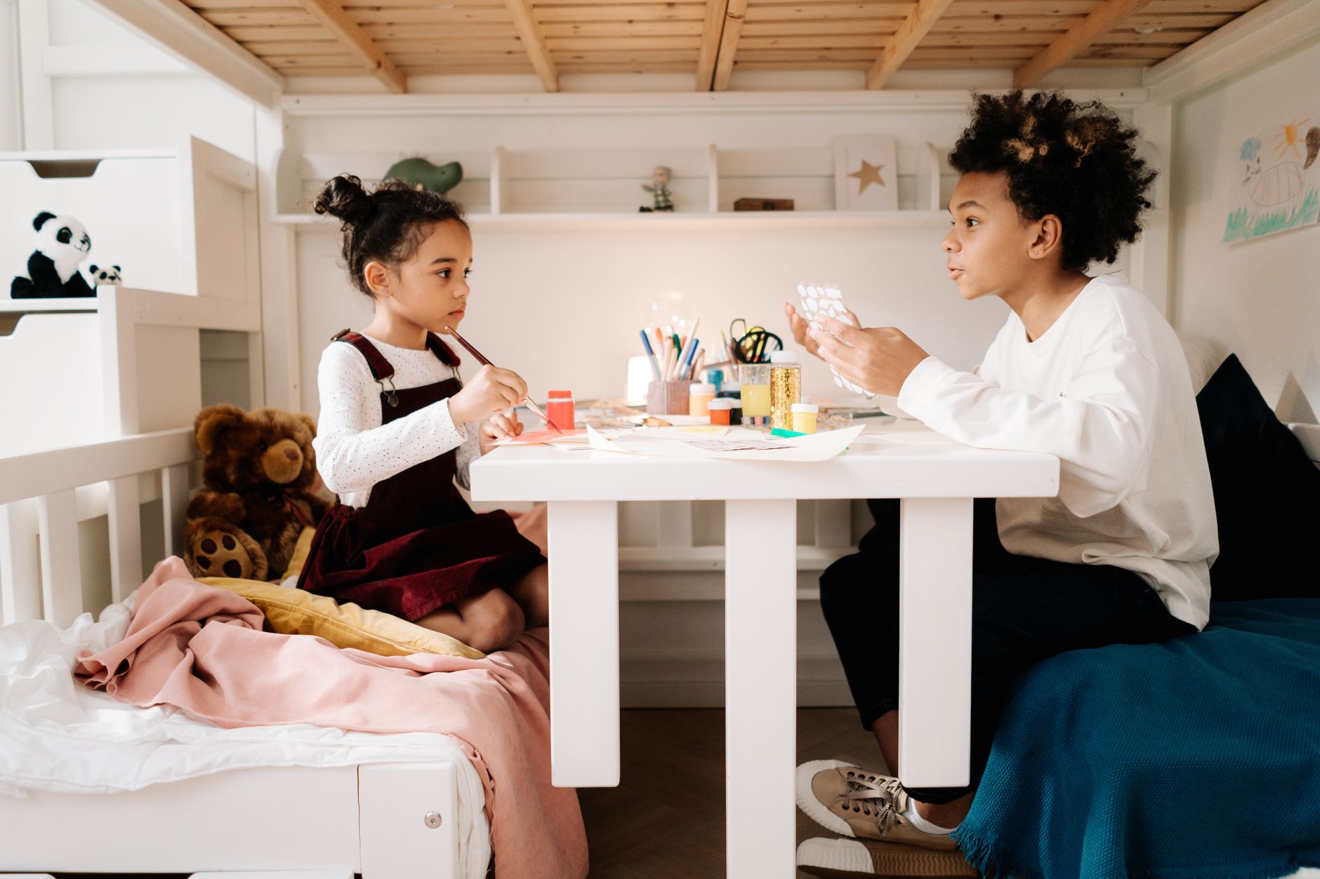
Choosing paint colours for a children's bedroom is one of those decisions that sounds simple until you're standing in front of a wall of swatches wondering whether "Sunshine Yellow" is going to keep a six-year-old wired until midnight. The colour affects mood, sleep and how quickly the room feels dated. Get it right and the space works for years. Get it wrong and you're repainting in eighteen months.
Why children's bedrooms need different thinking
A child's bedroom serves two competing functions: it's a place to play with full energy, and a place to wind down and sleep. Most adult rooms serve one dominant mood. A child's room has to do both, often within the same hour. That dual function is what makes colour choice genuinely tricky.
High-saturation colours, the kind sold as "fun" children's paints, push stimulation hard. Bright red, electric blue and neon green all increase heart rate and brain activity. That's fine for a playroom. In a bedroom, it works against sleep. Research in colour psychology consistently shows that softer, lower-saturation versions of the same hues calm the nervous system rather than firing it up. A dusty sage green and a neon green are not the same room, even if they're technically the same colour family.
If sleep quality is a priority, the same principles that apply to adult spaces apply here. Muted blues, soft greens and gentle warm neutrals reduce cortisol and lower arousal. Bright primaries, even well-intentioned ones, tend to do the opposite. For a deeper look at how colour affects sleep specifically, the article on choosing paint colours for a bedroom that help you sleep covers the psychology in more detail and applies directly to kids' rooms too.
Colours that actually age well
The fastest way to end up repainting a child's bedroom is choosing a colour that is too specific to a single age or interest. A toddler who loves dinosaurs becomes a nine-year-old who loves sport and a thirteen-year-old who wants the room to look nothing like it does now. Trendy licensed-character palettes age even faster.
The better approach is a versatile base with flexible accent options. Consider these starting points:
- Soft warm white with a yellow or peach undertone. Brighter than a stark cool white, but not overwhelming. Works at every age and photographs well.
- Dusty sage or eucalyptus green. Grounded, calming and genuinely timeless. Works with natural timber, white furniture and almost any bedding colour.
- Muted terracotta or clay. Warmer than grey, works beautifully in rooms with afternoon light, and holds its appeal through the teenage years.
- Soft chalky blue. Not bright navy, not powder blue, but the mid-range chalky version. Calming, fresh and works for any gender.
These base colours let the accessories, bedding and furniture do the age-specific work. The walls stay neutral enough to outlast phases.
How light direction changes everything
The same colour looks dramatically different depending on which way the room faces. A warm terracotta in a south-facing Melbourne room can look rich and grounded. In a west-facing room that floods with intense afternoon light, that same terracotta can look almost orange by 4pm. Light direction isn't optional context. It's the dominant factor in whether a colour lands the way you expect.
North-facing children's bedrooms, which tend to get cool, indirect light all day, often benefit from warmer tones that compensate for the lack of direct sun. Cooler colours in those rooms can feel flat and chilly, especially in winter. Rooms with strong afternoon or morning light can handle cooler, more neutral tones without feeling cold. The article on using dark paint colours without making a room feel small touches on how light direction affects perceived depth, which is relevant if you're considering deeper feature wall tones in a child's room.
Finish matters as much as colour
This is where children's bedroom painting decisions diverge most sharply from adult rooms. Kids draw on walls. They smear food, press stickers and rub muddy hands along painted surfaces without any apparent awareness that walls aren't designed for it. The finish you choose determines whether cleanup is a damp cloth moment or a full repaint.
Flat and matte finishes look beautiful and are terrible in a children's room. They absorb marks, can't be scrubbed, and show fingerprints at eye-wateringly high resolution. Satin and low-sheen finishes are the practical minimum for a children's bedroom. They're washable, reasonably durable and still look softer than a hard semi-gloss. Some areas, like around light switches and door frames, benefit from a harder semi-gloss finish for exactly the spots that get touched most.
There are also paints specifically formulated for high-contact residential surfaces. Dulux Wash&Wear is one widely used option in Australia, designed to handle repeated cleaning without breaking down. It's not the only choice, but it's worth knowing that purpose-built washable paints exist and perform meaningfully better than standard interior formulas in heavy-use rooms.
Feature walls: when they work and when they don't
A feature wall in a children's bedroom can work well, but the logic needs to be sound before you commit. The best feature walls in children's rooms are on the wall behind the bed head, which grounds the room and gives the space a clear focal point without overwhelming the whole room with a bold colour. That placement also means the bold colour isn't the first thing you see from the doorway, which tends to make rooms feel less busy.
Avoid putting a bold feature wall opposite a window. Strong afternoon or morning light will fight with any saturated colour on that wall, creating glare and making the room feel more intense than intended. A muted, textured colour works better in those spots than a flat bright one.
Murals are worth a mention. Painted murals have made a genuine comeback in children's rooms, and the technique of using a base wall colour that ties into the mural means the room doesn't feel stuck if the mural eventually dates. A mountain range silhouette in dusty blue-grey on a soft warm white wall, for example, reads as illustrative rather than character-specific, which means it stays relevant longer.
Getting children involved without losing control of the outcome
Involving children in colour choice is sensible. A room they had input on is a room they feel ownership over. The trick is structuring the choice so they can't choose something that makes the room unliveable in three years.
A practical approach: pick two or three pre-approved base colours yourself and let the child choose from those. Then offer a wider choice on a secondary accent element, whether that's a feature wall, the colour of shelving or even the trim on skirting boards. Children often care more about having influence than about the specific outcome, and a constrained choice gives them that without putting a neon orange ceiling in your hands.
The final decision on finish and product should always rest with the adults, regardless of who chose the colour. That's not a negotiation worth having with a seven-year-old.
Practical tips before you start
Test the colour in the actual room before committing. Buy sample pots and paint two or three A4-sized patches on different walls, then observe them through the full day: morning light, midday, late afternoon and with the artificial lighting on at night. Children's bedrooms often have warm-toned artificial lights that shift colours dramatically from their daytime appearance.
If you're repainting over a previously coloured children's bedroom, especially one with bright primaries, budget for a quality primer coat first. Bright colours bleed through new paint badly, and skipping primer is how you end up with three coats where two should have been enough. The guidance on painting over a previously painted surface covers this process in detail, including how to handle strong colours underneath.
Children's bedrooms reward practical thinking over trend-chasing. The right colour at the right saturation, in a washable finish, on walls that have been properly prepped, will look good for years and survive the kind of treatment no adult room ever faces.