
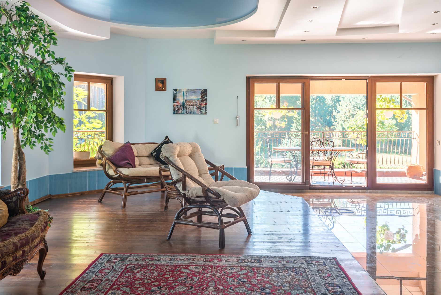
Biophilic colour palettes take their cue from the outdoors: the mossy green of a shaded fern, the warm ochre of sun-baked sandstone, the dusty blue of a cloudy sky just before rain. The idea behind biophilic design is straightforward. Humans evolved in natural environments, and spaces that echo those environments tend to feel easier to inhabit. Paint is one of the most direct ways to bring that principle inside.
What makes a colour palette "biophilic"?
Not every earthy shade qualifies. Biophilic colour is about saturation and tone as much as hue. The colours found in nature are rarely flat or pure. A leaf isn't just green. It's slightly yellowed, slightly greyish, slightly muted. A good biophilic palette works the same way: warm neutrals with visible undertones, greens that lean towards sage or olive rather than lime, blues that sit closer to slate than cobalt.
The other defining quality is harmony. Nature doesn't put colours in isolation. A forest floor has brown, rust, green and cream all at once. A biophilic room palette should do the same: at least three related hues that feel pulled from the same landscape, not three swatches that merely avoid clashing.
The four core colour families
Most biophilic palettes draw from one of four natural reference points. Each suits different rooms and different light conditions.
- Forest greens: sage, eucalyptus, olive and khaki. These sit beautifully in rooms with warm timber flooring and natural light. In darker rooms, pull the shade a little lighter toward sage to avoid muddiness.
- Earth tones: terracotta, warm ochre, sandstone and raw umber. These hues read as grounding and warm. They work especially well in living areas and studies.
- Stone and mineral blues: slate, dusty blue-grey, soft teal. Cooler than earth tones but still drawn from natural references, these feel calm without being clinical.
- Warm whites and creams: linen, bone, aged white with yellow or pink undertones. These form the connective tissue of a biophilic palette, sitting between deeper accent hues without interrupting the flow.
How to layer a biophilic palette across a room
The most common mistake is picking one nature-inspired colour and stopping there. A single eucalyptus green wall in an otherwise white room doesn't read as biophilic. It reads as an accent wall in a trendy shade. The palette needs depth.
Start with the dominant tone on the largest wall or walls. Then bring in a secondary shade for woodwork, built-ins or a ceiling. A warm cream ceiling over a sage-green wall immediately shifts the room away from the clinical feel that plain white ceilings can create. Finally, the third layer comes from furnishings, textiles and materials rather than paint. Rattan, raw linen, terracotta pots and timber all extend the palette without another coat of paint.
If you're working across an open plan space, the approach used for zoning spaces with paint applies directly: different biophilic hues from the same palette can define a dining area from a living zone while keeping the overall environment cohesive.
Light matters more than the swatch
A dusty sage can look genuinely beautiful in a north-facing Melbourne room bathed in afternoon sun. The same shade in a south-facing room can turn grey and slightly grim. This is the core challenge of any biophilic palette: natural colours are sensitive to natural light, sometimes brutally so.
Test every shortlisted colour in the actual room, on a large sample (at least an A3 sheet), and observe it at three points in the day: morning, midday and late afternoon. A shade that reads green at noon may read distinctly blue by 5pm. Understanding how a colour behaves under your specific light conditions is more useful than any swatch card.
The principles in choosing between warm and cool paint colours are worth revisiting here. A cool stone blue that feels refreshing in summer may feel cold and unwelcoming in winter, depending on how much direct light the room receives.
Biophilic colour in different rooms
Bedrooms respond well to the quieter end of the palette. Warm putty, soft sage and pale stone create the low-stimulation environment that supports sleep. Avoid anything with strong yellow undertones in a bedroom; they can read as stimulating rather than restful in artificial light.
Kitchens suit earth tones more than people expect. Terracotta on a feature wall or olive on cabinetry grounds the space without making it feel heavy. Keep the upper portions lighter and let the warmth sit at bench height and below.
Home offices benefit from the green family. Research from environmental psychologists consistently shows that green hues reduce eye fatigue and support focused attention. A soft eucalyptus or muted sage on the wall behind a monitor is a straightforward, practical choice.
Bathrooms are where the mineral blue family earns its keep. Slate, pale teal and dusty blue-grey work with natural stone finishes and timber vanities to create a spa-like feel that doesn't tip into coldness.
Choosing the right finish for nature-inspired colours
Biophilic palettes look their best in low-sheen or matte finishes. Flat and eggshell sheens absorb light the way natural surfaces do, giving the colour a depth that high-gloss simply can't replicate. Gloss paints reflect light sharply, which makes even a beautiful earthy hue feel synthetic.
For feature walls or areas of high wear, a low-sheen finish strikes the right balance. It's washable enough for practical use without the artificial gleam. Ceilings in warm cream or linen shades look best in flat or ceiling-grade matte. Understanding the full range of sheen options before you commit is worth the effort. The guide on choosing the right paint finish for every room covers the trade-offs clearly.
Starting points for an Australian home
Australian homes have particular advantages for biophilic colour. The light here is intense and warm, which means that pale, chalky versions of green, ochre and stone often perform better than their richer European equivalents. A hue that reads as muddy in a London flat can look luminous in a Melbourne terrace. Lean towards lighter saturation and let the light do the work.
The Australian landscape itself offers a ready reference: the blue-grey of eucalyptus bark, the warm terracotta of exposed earth, the olive-silver of native foliage, the bleached white of coastal ti-tree. These aren't abstract inspiration boards. They're the specific, grounded starting points that make a biophilic palette feel at home in this country.
Apex Painting helps Melbourne homeowners select and apply nature-inspired colour palettes with finishes that do the colour justice. Booking a consultation is the fastest way to take a palette from concept to a room that actually feels the way it's supposed to.