
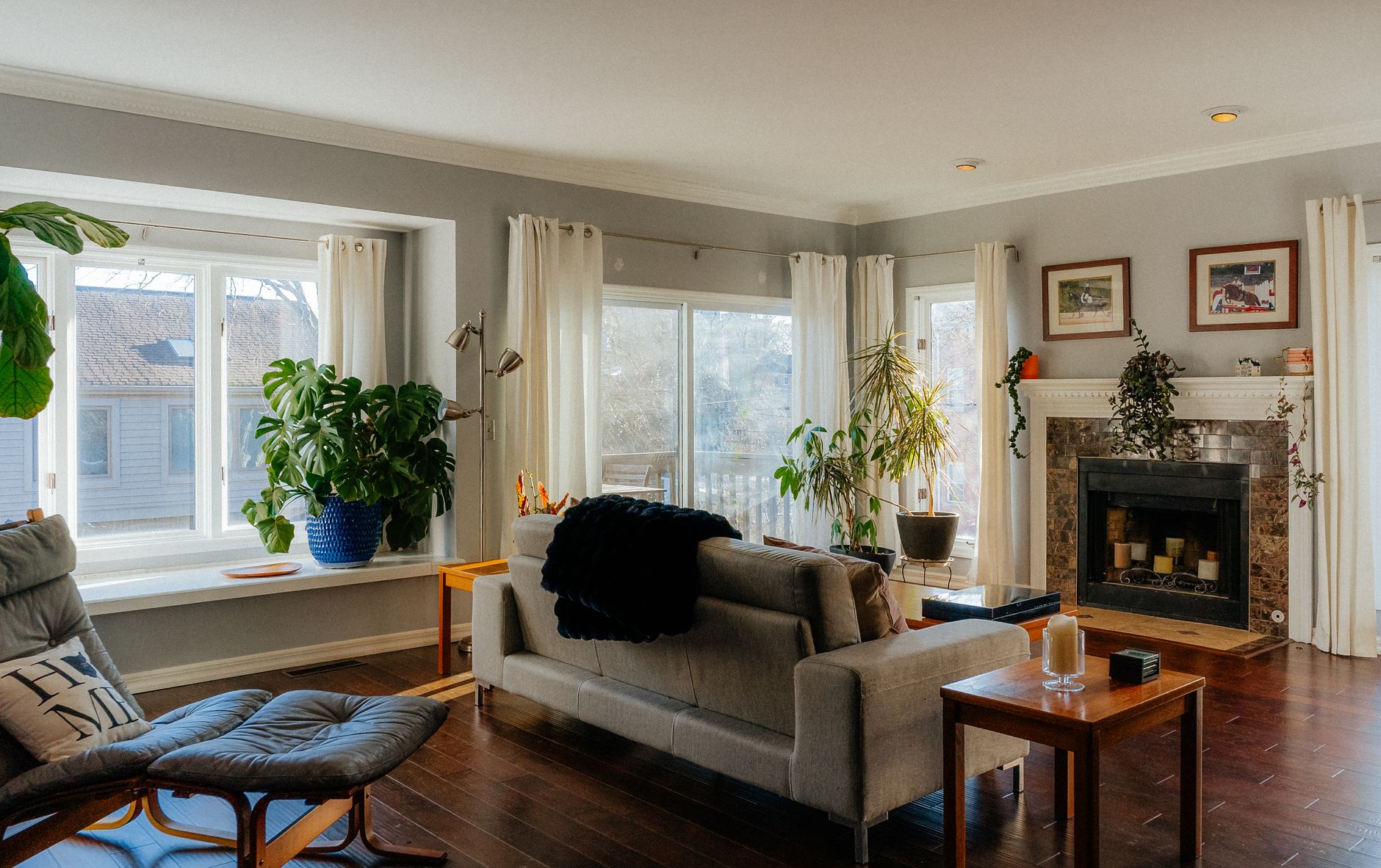
North-facing rooms are one of the trickier colour briefs in any Melbourne home. Unlike south-facing rooms that catch direct afternoon sun, north-facing spaces sit in cool, reflected daylight for most of the day. That kind of light is diffuse and slightly blue-grey in tone, which makes colours read differently on the wall than they did on the sample card. A white that looks crisp in the shop can turn chalky. A beige can lean green. A warm terracotta can suddenly look almost muddy.
The fix isn't complicated, but it does require understanding how light temperature affects pigment before you open a tin.
Why north-facing light is different
In the Southern Hemisphere, north-facing rooms receive indirect light. The sun tracks across the northern sky, so these rooms don't get direct sunlight the way a south-facing room in the Northern Hemisphere does. The light that enters is bounced and diffuse. It sits in the cooler part of the spectrum: soft blues, greens and greys tend to intensify, while warm tones can lose their edge.
The effect is most noticeable in the middle of the day and in winter, when the sun angle is low and the light raking in through windows carries even less warmth. Rooms that seem adequately lit in the morning can feel quite flat by mid-afternoon.
Colours that work well in north-facing rooms
The goal is to counteract the cool bias of the light without overcorrecting into something that reads orange under artificial light at night. A few categories of colour reliably perform well.
Warm whites and off-whites. Pure whites with a blue or grey undertone will amplify the room's coolness. Look instead for whites with a yellow, pink or cream base. Dulux's Antique White USA is a long-standing choice for this reason: the warm undertone holds its softness in diffuse light without looking dingy. Warm off-whites also pair well with timber floors and natural joinery, which are common in Melbourne's older homes.
Pale yellows and honey tones. These borrow warmth directly from the yellow end of the spectrum and resist the greying-out effect that cooler light inflicts on other colours. They read as light and airy rather than yellow, provided you stay in the softer registers. Deep mustard is a different story and should be tested carefully.
Blush and dusty pinks. These sit in the warm-cool middle ground. They hold up well under diffuse light and don't shift dramatically between natural and artificial light. A dusty blush on a north-facing wall creates a quiet warmth that feels considered rather than deliberate.
Terracotta and warm clay. Bolder than the others, but effective when the room is large enough to absorb the depth. In a small north-facing room, test a sample on a large board first. Pale versions of terracotta can read almost like a warm white in cooler light, which is exactly what you want.
Colours to avoid, or approach carefully
Cool greys and blue-greys are the most common mistake in north-facing rooms. They read beautifully in light-filled spaces but turn steel-cold in rooms with indirect light. Sage greens and mint tones carry a similar risk. The cool light pulls the blue out of the green, making the wall look grey-green rather than the botanical shade it appeared in the sample.
Stark white (pure white with no undertone) is another trap. It doesn't warm the room, and it can make the space feel clinical. If you're drawn to white, choose one with at least a slight cream or pink cast and test it in the actual room across two or three days, including on an overcast day, which is when north-facing rooms show their worst.
How to test colours properly before committing
Sample boards beat painted patches on the wall. Paint a large piece of cardboard or thick paper, at least 30cm by 40cm, and move it around the room at different times of day. Hold it against the ceiling, the floor and the main piece of furniture. Colours that read consistently across morning, midday and artificial evening light are the ones worth committing to.
Don't test samples on an existing dark or strongly coloured wall. The base colour bleeds through and distorts the reading. If that's your situation, prime the test patch first or paint over white paper.
Also consider the finish. In a room that's already fighting low light, a flat or matte finish absorbs what little light there is. A low-sheen or eggshell finish reflects slightly more without the glossy look, and it's more practical in living areas. If you're choosing finishes across the whole house, choosing the right paint finish for every room is worth reading before you finalise anything.
Ceiling and trim colours matter too
In a north-facing room, the ceiling does real work. A warm white ceiling reflects ambient light back into the space and softens the overall effect of cooler wall colours. A brilliant white ceiling over a warm wall can create too much contrast, making the ceiling look stark and the walls look darker by comparison.
Trim colour follows a similar logic. White trim with a warm undertone creates continuity. Crisp, cool-white trim can create a jarring contrast that draws the eye to edges rather than into the room.
What this means for open-plan spaces
Many Melbourne homes have north-facing open-plan areas that flow into south-facing zones. This is where colour consistency becomes important. A warm white that works in the north-facing living area may read slightly different in a brighter south-facing kitchen. The answer is usually to test colours at the transition point and accept slight variation rather than chase a perfect match. Using tone rather than exactly the same colour across zones is a technique covered in detail in how to zone spaces with paint in open plan living.
North-facing rooms don't need to feel like a compromise. A good colour choice treats the cool, diffuse light as a given and works with it. Pick warm undertones, test thoroughly across real conditions, and keep the finish reflective enough to bounce what light is there back into the space.