
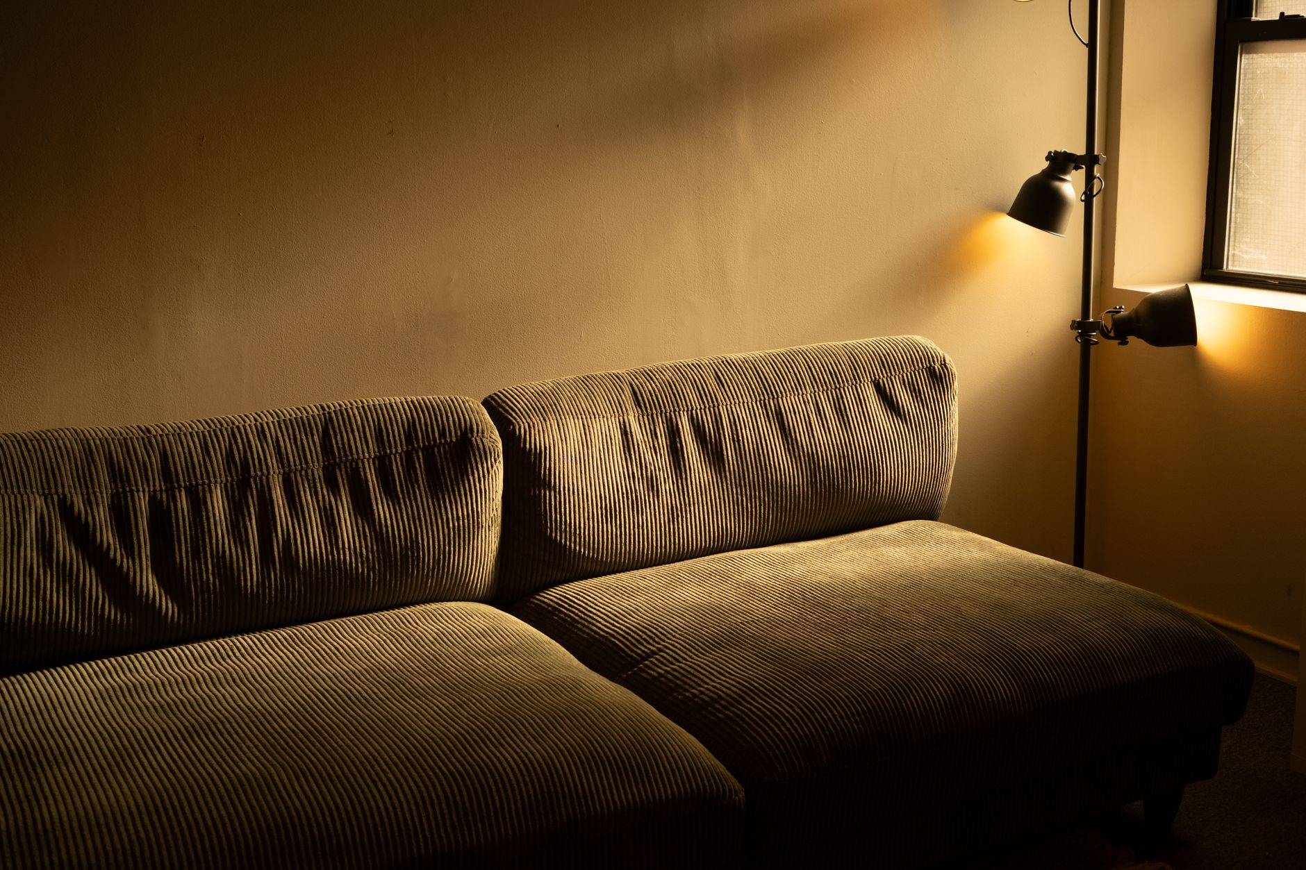
Windowless rooms present one of the trickiest colour challenges in any home. Whether it's an internal bathroom, a walk-in wardrobe, a basement study or a converted storeroom, the absence of natural light removes the variable that most paint colour advice is built around. Get the colour wrong and the room feels like a cave. Get it right and the space feels deliberate, calm, and genuinely usable. Apex Painting works with Melbourne homeowners on exactly these rooms regularly, and the approach is different enough from a standard room that it deserves its own treatment.
Why windowless rooms behave differently
In a room with windows, natural light shifts through the day. It softens colours in the morning, saturates them at noon and warms them at dusk. That constant variation flatters a wide range of paint choices. A windowless room has none of that variation. The only light hitting the walls comes from fixed artificial sources, and those sources have a colour temperature that the paint will amplify or fight against every hour the room is in use.
Most LED downlights sit between 2700K and 3000K, which is a warm, slightly yellow cast. Cooler globes run at 4000K or above, which is closer to daylight white. The colour temperature of your lighting is, effectively, your replacement for the sun. Before you choose a single paint chip, identify what globes are in the room and whether you can change them. That decision shapes everything else.
Light colours: not always the answer
The instinct in a dark room is to go white. It's a reasonable reflex, but pure white under warm artificial light reads as cream or pale yellow rather than crisp white. Stark white under cool lighting reads clinical and flat. Neither is wrong exactly, but neither is what most people picture when they reach for the paint chart.
Off-whites with a warm undertone, think shades like linen, pale biscuit or soft warm grey, work well under 2700K to 3000K lighting because the undertone aligns with the light source rather than clashing with it. They read as warm neutrals rather than dingy whites. Dulux produces a range of off-whites specifically calibrated for low-light interiors, and it's worth looking at their colour chart under actual artificial light rather than on a screen or in a paint shop window.
The other mistake is choosing a cool, blue-toned white to "brighten" a windowless bathroom under warm LEDs. The warm light hits the cool paint and produces a murky, greenish cast that no amount of cleaning will fix. This is the most common complaint Apex Painting hears from homeowners who've painted a windowless room themselves.
Mid-tones and the deliberate dark room
There's a strong case for going the other way entirely. Rather than fighting the absence of natural light, lean into it with a confident mid-tone or even a deep, enveloping colour. A windowless room painted in a warm charcoal, deep sage or dusty navy doesn't feel darker than a white room under the same artificial light. It feels intentional. The contrast between the coloured walls and well-placed lighting creates depth rather than absence.
This approach works best in rooms that have a single clear purpose: a media room, a wine cellar, a reading alcove. The colour signals that this space is for a specific activity, and that framing makes the lack of windows feel atmospheric rather than unfortunate. For guidance on how dark colours behave in enclosed spaces, the advice in the article on how to use dark paint colours without making a room feel small applies directly here.
The key constraint with dark colours in windowless rooms is finish. Flat and matte finishes absorb light and can make a dark colour feel genuinely oppressive. A satin or low-sheen finish on the same colour reflects more of your artificial light back into the room, keeping the space alive.
Finish matters more than in any other room
In a sunlit room, finish affects cleanability and how the surface reads across the day. In a windowless room, finish determines how much light the paint returns to the space. This is the single most important technical decision you'll make.
- Flat/matte: absorbs light, makes any colour feel heavier and quieter. Reserve for feature walls where you want drama.
- Low sheen/eggshell: the practical sweet spot. Reflects enough light to keep the room feeling open, still wipeable in bathrooms or utility spaces.
- Satin: good for small windowless bathrooms and laundries where moisture is a factor and light reflection matters.
- Semi-gloss or gloss: high reflectivity, useful on ceilings and joinery in windowless rooms, but on full walls it can look plastic under artificial light.
The ceiling in a windowless room is worth special attention. Painting it a shade lighter than the walls, or using a white with a warm tint rather than a standard ceiling white, bounces artificial light downward more effectively than a standard flat ceiling white and reduces the sealed-in feeling.
Colour psychology in a room with no view
Windows give a room a visual escape. Without them, the walls are everything the eye rests on. Colours that feel fine in a large windowed room can feel relentless in an enclosed one because there's nowhere else to look. This is why saturated, high-chroma colours are risky. A vivid teal or a bright terracotta might work beautifully in a living room with garden views. In a windowless room, the same colour saturates the eye within minutes.
Low-chroma versions of those same hues, muted sage instead of vivid teal, warm blush instead of terracotta, give you the warmth and personality without the intensity. The colour psychology principle at work is simple: the eye needs somewhere to rest. Muted, grounded tones give it that rest in a way that high-chroma colours don't. For a deeper look at how colour affects comfort and mood across rooms, the piece on colour psychology and how paint colours affect mood at home covers the research in useful detail.
Practical tips for testing before you commit
Testing paint in a windowless room requires a different process to testing it in a sunlit space. Paint two large A3 boards (ideally 40cm square) with two coats of your shortlisted colours and prop them against different walls at different times of day. Check them with the room's main lights on, with a lamp on, and with the door closed. The colour you see in a sunny hallway or at a paint shop is not the colour you'll live with.
Test boards beat painted patches on the wall because you can move them. Windowless rooms often have one corner that gets more reflected light from a lit hallway and another corner that's genuinely darker. The same paint reads differently in each. A test board shows you both conditions without committing to a full coat.
Switch your globes to the temperature you plan to use permanently before you test. It sounds obvious, but Apex Painting often finds that a homeowner has tested colours under the existing globes and then changed them to warm LEDs after painting, which shifts the whole palette.
One room, one function
The strongest windowless rooms are painted to serve one purpose clearly. A windowless study benefits from a calm, low-stimulus palette. A windowless bathroom benefits from a clean, fresh tone with high reflectivity. A windowless storage or dressing room can afford to be bolder because it's used for short visits rather than extended stays. Trying to make a windowless room do two things, or trying to make it feel like it has a window when it doesn't, produces compromises that never quite land. Work with what the room is, and the paint will follow.