
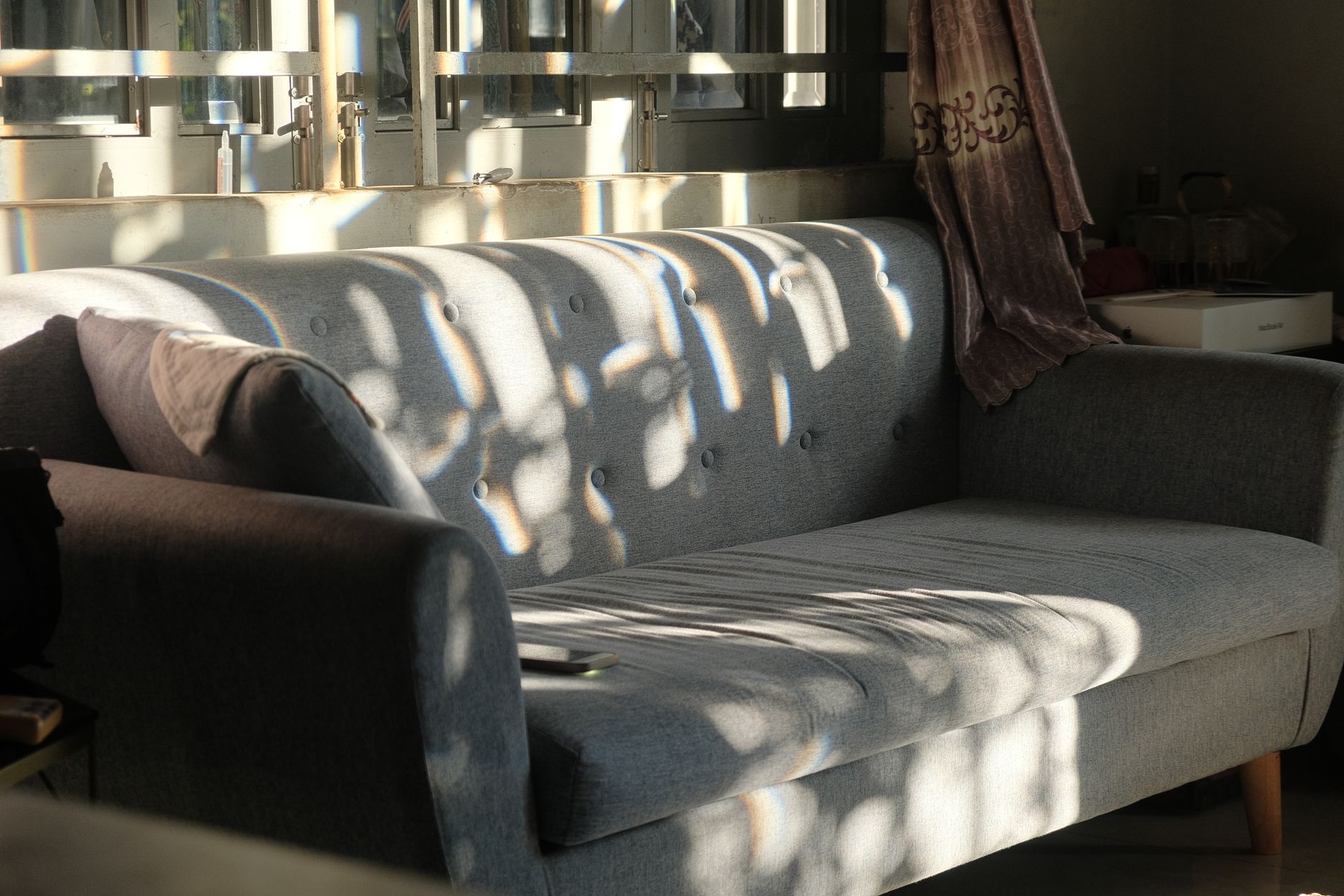
West-facing rooms are among the most deceptive to paint. In the morning they sit in cool shadow, looking grey and flat. By mid-afternoon they flood with the warmest, most directional light in the house. Any paint colour you choose has to work across that full range, not just at the one moment you held the sample card up to the wall. Getting it right takes a little understanding of how that shifting light behaves and which colours hold their character under pressure.
Why west light is different from every other orientation
West-facing light arrives low on the horizon in the afternoon and early evening. It's warm in colour temperature, sitting in the amber-to-orange range, and it hits surfaces at an angle rather than straight on. That angled light amplifies texture, makes paint sheen visible from across the room and pushes warm paint colours into territory that can quickly feel overpowering.
The light also moves fast. From around 2pm to sunset, the quality shifts more in a west-facing room than in a north or east-facing one. A colour that looks balanced at 3pm can look startlingly orange by 6pm. That daily range is the core challenge.
Understanding orientation is part of creating visual flow between rooms, particularly when adjacent spaces face different directions and share a sightline. A west-facing lounge that connects to a south-facing hallway needs a palette that doesn't clash as the light shifts through the afternoon.
Colours that handle west light well
The instinct is to fight the warmth with cool colours. That can work, but only in specific circumstances. Cool whites and blue-greys often look clean in the morning and then take on a bruised, greenish cast as the warm afternoon light hits them. The better approach, for most west-facing rooms, is to work with the warmth selectively.
Soft, warm whites with a yellow or cream undertone absorb afternoon light gracefully. They don't fight it. Dulux's Antique White USA is a classic example: it's warm enough to feel intentional rather than dingy in morning shadow, and it doesn't scorch under afternoon sun.
Warm greens, particularly those with a yellow-green or sage base, perform well in west-facing rooms because they sit in the middle of the colour wheel. They stay coherent as the light shifts from cool to warm. Strong sage, dusty olive and dried-herb tones all read beautifully in golden afternoon light without tipping into excess.
Terracotta and rust tones are a confident choice if the room is used primarily in the afternoon or evening. These colours are built for warm light. They lean into the sunset quality of west-facing rooms rather than competing with it. That said, they need careful handling in smaller rooms where the afternoon heat is already a factor.
Colours to approach with caution
Bright whites with cool or blue undertones can look great on a south-facing wall and terrible in the same house facing west. The afternoon light strips the coolness out of them and leaves an unpleasant yellowish residue. Always test white samples under afternoon conditions before committing.
Strong blues and purples are high risk. In morning shadow they often look flat. As the warm light intensifies, they take on an odd brownish quality that reads as dirty rather than bold. If you're set on a blue for a west-facing room, keep it very light and slightly warm in undertone.
Saturated reds amplify fast. A terracotta that looks earthy and restrained in diffuse light can feel like the inside of a furnace by 5pm in midsummer. This isn't a reason to avoid warm colours entirely. It is a reason to test them at their most extreme, in full afternoon sun, before buying a full tin.
Choosing paint colours for rooms with challenging light conditions is closely related to the principles behind choosing paint colours for a south-facing room, though the problems differ. South-facing rooms in Australia receive intense direct light across the whole day; west-facing rooms deliver a concentrated blast in the second half. The solutions aren't identical, but the habit of testing at the worst-case moment is the same.
How to test samples properly in a west-facing room
Stick your paint samples directly onto the wall, not onto card or board. A sample card held up to the wall sits in front of it, reflecting differently to paint applied on the surface itself.
Make each sample at least 30 x 30cm. Small patches are nearly useless because the eye interpolates the surrounding colour into the gap and you're not seeing the paint at all, you're seeing an average. Paint two coats of each candidate and let them dry fully before judging.
Look at the samples at three specific times: before 10am, around 2pm and around 5pm or 6pm. That last window is the critical one for west-facing rooms. If a colour survives the late afternoon without looking garish or washed out, it'll work. If it doesn't survive that test, no amount of optimism at the paint counter will fix it.
Sheen level matters more in west-facing rooms
Angled afternoon light makes sheen visible in ways that overhead light doesn't. A semi-gloss in a west-facing room will reflect the sun back across the room in a way that feels aggressive by mid-afternoon. Low sheen finishes, flat or low-sheen eggshell, absorb that directional light rather than bouncing it. This is one room type where a flat finish on walls is genuinely worth considering, even in high-traffic areas.
The exception is a west-facing kitchen or bathroom where washability is non-negotiable. In those rooms, use the lowest sheen that still allows cleaning. A satin rather than semi-gloss is a reasonable compromise.
Using paint to manage perceived heat
West-facing rooms can feel physically hot in summer, and the paint colour contributes to that perception even if it doesn't change the thermometer. Cooler tones on the floor, through rugs or flooring materials, combined with a warm but not saturated wall colour, create a visual balance that counters the sense of heat. Ceiling colour matters too: a ceiling painted a slightly lighter, cooler version of the wall colour adds some visual relief and draws the eye upward, making the space feel less oppressive.
If the room has large west-facing windows and the afternoon heat is severe, it's worth considering that paint is one part of a broader strategy. Blockout blinds and reflective window film address the source; the paint manages the perception.
A practical shortlist for west-facing rooms
The colours that consistently perform well in west-facing rooms share a few traits: they're warm in undertone, moderate in saturation and low enough in chroma that the afternoon light amplifies them to a pleasant rather than overwhelming finish. Warm whites, soft sages, warm taupes, dusty terracotta and greyed-down ochres all sit in this zone. The colours that consistently struggle are cool whites, saturated blues, stark purples and anything with a green undertone that tips toward aqua.
Work through your shortlist with proper samples, test at the harshest time of day and trust the test rather than the sample card. A west-facing room painted well is one of the warmest, most inviting spaces in a Melbourne home by early evening. It's worth the extra hour of testing to get it right.