
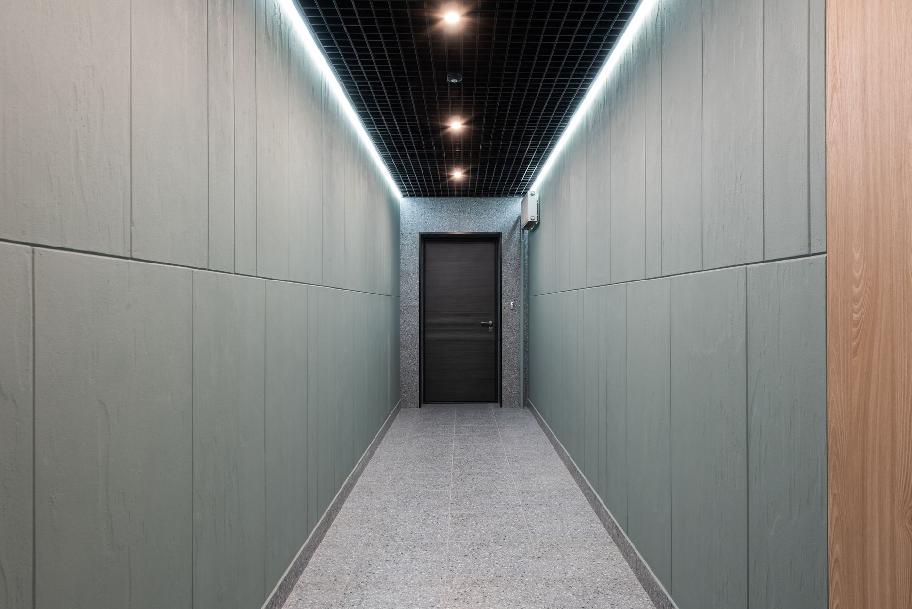
The hallway is one of the most-used spaces in any home, yet most people treat it as an afterthought. It gets a coat of whatever was leftover from the living room, or a safe off-white that disappears without contributing anything. That's a missed opportunity. A well-considered hallway paint scheme can set the tone for the entire home, guide the eye through the space, and make a corridor that's only 90 centimetres wide feel genuinely comfortable to move through.
Why hallways need a different approach
Most rooms are judged in a moment. You walk in, take in the space, and your eye settles. A hallway is experienced in motion. Your eye moves along the walls, registers the floor, and lands on whatever is at the end of the corridor. That sequence matters enormously, and it's what makes a hallway different from any other room in the house.
Colour choices that work in a bedroom or lounge can actively hurt in a corridor. A strong saturated tone that feels cosy in a wide living room will compress a narrow hallway. A very pale colour that reads as clean in a bright kitchen can feel stark and clinical when flanked by two walls only a metre apart. The goal is to work with the proportions, not against them.
The ceiling trick most people overlook
Paint the ceiling the same colour as the walls, or one shade lighter. It sounds counterintuitive, but in a hallway this approach removes the visual box effect that two different tones create. When the wall and ceiling colour differ sharply, your eye reads the space as shorter and more constrained. When they blur together, the vertical plane feels taller. It's the same principle used in making low ceilings feel taller with paint, applied to a different proportion problem.
If the ceiling is genuinely high (2.7 metres or more), you can afford more contrast. Paint the ceiling a shade deeper than the walls, which pulls the eye upward and makes the height feel deliberate rather than accidental.
Choosing the right tone for the walls
The two most common mistakes in hallway colour are going too dark (which shortens the corridor visually) and going too pale (which produces a lifeless, transitional feeling). The sweet spot is a mid-toned colour with a warm undertone: think soft terracotta, dusty sage, warm stone, or muted clay. These tones hold up well under the artificial lighting that hallways often rely on, and they read as deliberate rather than safe.
Consider where the hallway leads. If it connects to a living area with warm timber floors and earthy tones, continue that palette through the corridor. A sharp colour shift between a hallway and the main living space makes the home feel disjointed. Your hallway should feel like part of a sequence, not an interruption. The same instinct applies to coordinating colours across open-plan kitchen and dining areas, where visual continuity does most of the work.
Using a dado line to add structure
A dado rail, or a painted dado line, divides the wall horizontally and gives you two zones to work with. Paint the lower third or lower half in a deeper tone and the upper portion in a lighter one. This does two things: it protects the lower wall (which takes more knocks and scuffs) with a finish that's easier to clean, and it gives the hallway a considered, architectural quality that a single flat colour can't achieve.
The split doesn't need to be dramatic. A wall painted in warm linen above the dado with a soft charcoal below reads as sophisticated without feeling heavy. Keep the upper and lower tones from the same colour family and you won't go wrong.
The floor and skirting connection
Hallway paint doesn't work in isolation. The floor and skirting boards are always in frame. Dark timber floors absorb light; if your corridor already feels dim, paint the walls in a warm light tone and keep the skirtings white or near-white to bounce as much light as possible along the length of the space.
Pale or mid-grey floors read as cool and neutral. They pair well with both warm and cool wall tones, but be cautious about combining a cool-grey floor with a cool-grey wall. The result can feel flat. One element should provide warmth, and that's usually the wall.
The end-of-corridor focal point
If your hallway terminates at a wall (rather than opening into another room), treat that end wall as a focal point. Paint it a shade deeper than the side walls, or in a complementary accent colour. This does something useful: it gives the eye a destination and makes the corridor feel intentional rather than just functional. A single piece of artwork on that wall, framed by the deeper tone, can turn a forgettable passageway into a genuine feature.
The logic here parallels how accent walls work elsewhere in the home. The difference is that in a hallway, the "accent" end wall is defined by its position in the sequence, not just by the colour choice alone. For more detail on how to make an accent colour work without overwhelming a space, the guidance on picking the right accent wall colour applies directly.
Finish matters as much as colour
Hallways take more daily contact than almost any room in the house. Shoulders brush the walls. Bags scrape corners. Children's hands touch everything at a consistent height of about 90 centimetres. For that reason, a flat or low-sheen paint is the wrong choice for this space, regardless of colour.
Use a satin or low-lustre finish. It reflects enough light to brighten the corridor, and it cleans far more easily than a matte. Keep the sheen consistent across walls and ceiling, unless you're deliberately contrasting the dado zones, in which case the lower zone can carry a slightly harder finish for durability.
What to avoid
Pure bright white is the most common hallway mistake. It looks clean in a showroom and flat in a real corridor. It picks up every shadow from the ceiling and every scuff from the walls, and it ages poorly under fluorescent or downlight-only conditions. If you want light, choose a white with a clear warm undertone (look for words like "cream," "linen" or "oyster" on the swatch) rather than a cool, stark white.
Avoid wallpaper-style feature panels on both side walls simultaneously. One side can work; both sides compress the space and create a visual tunnel effect. If you want texture or pattern, keep it to one wall or restrict it to the dado zone on both sides.
The hallway earns its keep when it's treated as the introduction to the home, not a gap between rooms. A confident colour choice, the right finish, and a clear focal point at the corridor's end make a difference that visitors register the moment they walk through the front door.