
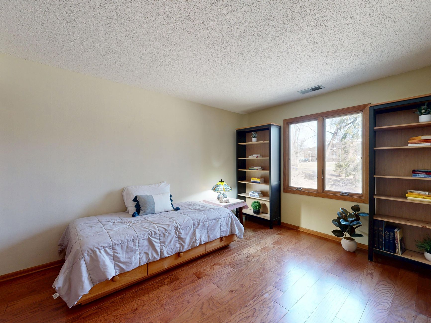
The spare room that moonlights as a home office, a guest bedroom and occasionally a hobby space is one of the most common rooms in Australian homes right now. It's also one of the most under-thought when it comes to paint. Most people just pick a neutral and move on, then wonder why the room feels like it doesn't quite belong to either function. Getting the colour, sheen and zoning strategy right from the start saves a repaint within two years.
Why a dual-purpose room is harder to paint than it looks
A single-use room has a clear emotional brief. A bedroom is for winding down. An office is for focus. A dual-purpose room asks paint to serve two different psychological states at once, and standard advice for either room in isolation won't get you there. Paint a spare room in deep calming tones suited to sleep and the daytime work hours feel sluggish. Choose a bright, energising office palette and guests won't sleep well.
The answer isn't a compromise colour sitting halfway between the two. It's a zoning strategy that lets colour do different jobs in different parts of the room without the space feeling fractured.
Start with the room's primary function
Before choosing a single colour, decide which function the room serves most often. If it's used as a home office 4 days a week and a guest room 5 nights a year, the office wins. If it's genuinely split, default to the function that requires the most sustained mental engagement, which is almost always the office side. You can adjust a guest's experience with bedding, lighting and blinds. You can't easily fix a colour that actively works against daily concentration.
For rooms that lean toward work, mid-toned greens and soft sage tones perform consistently well. They're close enough to the natural world to feel restful without being soporific. Dulux's Dulux Colour Forecast palette has leaned into these naturalistic greens for the past two years, and there's a practical reason: they support focus without overstimulating the space.
Use an accent wall to separate zones
A dual-purpose spare room benefits from one wall treated differently to the rest. This isn't a feature wall for decoration. It's a functional boundary that tells the brain which part of the room belongs to which activity.
Place the desk against the accent wall if possible. A slightly deeper tone on that wall (2 to 3 shades darker than the main walls) frames the workspace without making it feel like a separate room. When guests use the space, that wall reads as backdrop. When you're working at the desk, it acts as a visual anchor that reduces the sense that you're working in a bedroom. For a full breakdown of how paint can carve distinct zones from a single room, the approach used in using paint to separate a shared bedroom translates directly to this kind of layout.
Choosing the right sheen for both functions
Sheen is often overlooked in a spare room because it doesn't feel as exciting as colour. It matters more here than in most rooms. A home office surface gets touched: hands brush walls near the desk, charging cables drag against skirting, chairs roll back into the paint. A guest bedroom surface needs to hide scuffs without looking clinical.
Low-sheen paint (not flat, not semi-gloss) is the right call for most spare room walls. It's washable enough for the office function, diffuses light softly enough for the guest bedroom function, and it doesn't emphasise wall imperfections the way a higher sheen would. Reserve a satin or semi-gloss finish for the skirting boards, window trims and any joinery. If you're painting a desk nook or built-in shelving, a semi-gloss on those surfaces makes cleaning easy without affecting the overall feel of the room. The guide on choosing the right paint finish for every room covers the sheen ladder in detail if you need a reference point before committing.
Colours that genuinely serve both functions
Three tonal families consistently work across both office and guest bedroom briefs:
- Warm off-whites and linen tones. Not stark white, which reads cold under artificial light. A warm off-white with yellow or pink undertones flatters both work and rest without committing to a mood.
- Soft sage and eucalyptus greens. Mid-toned greens with grey in them are calm enough for sleep and grounded enough for focused work. Avoid yellowy greens, which can feel unsettled under warm globe lighting.
- Dusty blue-greys. Cooler than greens but not cold, these tones read as professional during work hours and genuinely restful at night. They're forgiving of different light conditions throughout the day.
Avoid anything saturated or highly chromatic. A bold terracotta or deep navy might look compelling in a design magazine, but in a room that needs to shift function by the hour, strong colour becomes fatiguing within a week.
Ceiling and trim: don't cut corners here
Spare rooms often get ceiling paint applied from whatever tin was left over from another job. It shows. A fresh coat of ceiling white (a true white, not the wall colour diluted) brightens the room and makes it feel more deliberate. In a small spare room, a bright ceiling does more perceptual lifting than almost any wall colour choice.
White or off-white trim throughout is the right call. It keeps the room from feeling like it's trying too hard, and it reads as clean and put-together whether guests or clients (via video call) are looking at it.
Common mistakes in dual-purpose spare rooms
Painting a different colour on every wall in an attempt to zone the space is the biggest mistake. It produces visual noise rather than function. One accent wall and three consistent walls is the maximum. Any more and the room reads as indecisive rather than intentional.
The second mistake is using flat paint to save money. Flat paint can't be wiped down, and a home office wall will accumulate marks within months. Low-sheen isn't a compromise. It's the correct specification for this kind of room.
The third is ignoring the door and window trims entirely. Fresh wall paint next to tired, yellowing architraves immediately draws the eye to what hasn't been done. Budget for the trim when you budget for the walls. Both surfaces together take less time than most people assume.
Prep makes or breaks the final result
Spare rooms that have lived multiple lives often have more wall damage than other rooms: picture hooks, cable channels, furniture scuffs at desk height, and old blu-tack marks. Fill every hole with a quality ready-mix filler, sand back flush, and prime the patches before topcoating. Skip the priming step and every patched spot will show through as a dull spot under raking light.
If the room has previously been painted in a dark or saturated colour, use a tinted primer before applying the new topcoat. Without it, you'll need three full coats of the lighter colour to achieve an even result. Two coats over a tinted primer is cheaper and faster.
Apex Painting applies this sequencing on every spare room project: strip fittings, fill and prime, two coats on ceiling and walls, two coats on trim. The order matters as much as the products. Painting trim after walls means you don't need to tape the walls during the trim stage, which cuts time and produces a cleaner line.