
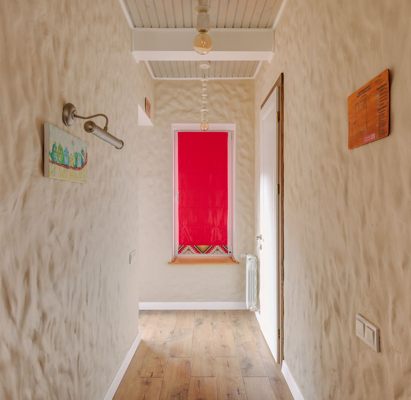
Hallways present a specific paint problem: they're long, narrow, often poorly lit, and every design choice gets seen at close range by anyone who walks through the door. Most people reach for a light neutral and call it done. That works, but it doesn't work as hard as it could. With the right combination of colour, sheen and technique, you can make a hallway read as genuinely wider than its dimensions suggest.
Why hallways behave differently to other rooms
A hallway isn't experienced like a room. You move through it rather than sit in it, which means your eye reads the walls in a long, continuous sweep rather than as a contained space. That sweep is what makes narrow corridors feel tight: the two walls run in parallel and your brain registers the distance between them immediately.
Paint can interrupt that reading. The goal isn't to trick anyone. It's to give the eye somewhere else to land, break up the tunnel effect and reduce the visual weight pressing in from both sides.
Colour choices that open up a hallway
Lighter colours reflect more light and push walls back visually. That's true. But the specific undertone matters more than the lightness alone. Cool-toned whites and pale greys with a blue or green base tend to read as receding, which is exactly what a narrow hallway needs on its side walls.
Warm whites and creamy off-whites can work well too, especially in hallways that get some natural light through a front door or skylight. The warmth adds welcome without visually closing in, provided the tone stays genuinely pale. Where homeowners get unstuck is choosing a warm neutral that looks clean in the store and then reads as yellow or peach under artificial downlights.
One approach worth considering: paint the end wall of the hallway a slightly deeper tone than the side walls. This is a perspective trick. A darker endpoint draws the eye forward and makes the corridor feel like it has a destination rather than just two parallel planes. It's a technique borrowed from theatre set design and it works in domestic corridors of almost any size. For more on how to apply this kind of spatial thinking with colour, the article on how to use paint to visually resize an awkward room covers the underlying principles in detail.
The ceiling is part of the equation
Most people paint hallway ceilings in standard ceiling white and move on. That's a missed opportunity. Painting the ceiling the same colour as the walls (or a shade lighter) creates a cocooning effect that actually makes a narrow space feel more intentional rather than squeezed. The eye stops registering the width as a deficiency and starts reading it as a deliberate design choice.
If the ceiling is high enough (anything above 2.7 metres), you can push the ceiling colour a touch darker than the walls to bring it down visually and make the overall proportions feel more balanced. Low ceilings are a different matter: keep them as light as possible to maintain the sense of headroom.
Whatever you decide on the ceiling, painting a hallway ceiling without streaks or lap marks is a job that rewards careful prep. The long, narrow space amplifies roller marks in a way a larger room doesn't.
Sheen levels and why they matter more in a hallway
Sheen is the most underestimated variable in a hallway paint job. High-traffic corridors get touched constantly: hands brushing the walls, bags catching corners, kids running fingers along the surface. You need a finish that wipes clean. But a highly reflective finish in a narrow space bounces light in ways that can actually emphasise the parallel wall effect you're trying to reduce.
The practical answer is a low-sheen or satin finish on the walls. It's washable, it doesn't telegraph every surface imperfection, and it doesn't create the competing reflections that semi-gloss produces in tight spaces. Keep semi-gloss for skirting boards and architraves, where durability and a crisp line do genuine work.
On a timber-floored hallway, a painted skirting in a bright white creates a strong horizontal line at floor level. That line actually anchors the space and helps the walls read as taller rather than closer together.
Vertical versus horizontal emphasis
There's a common piece of advice that says vertical stripes make a room taller. True. But in a hallway, what you often want is horizontal emphasis rather than vertical: something that draws the eye along the length of the corridor rather than up and down the walls. A picture rail painted in a contrasting colour, a dado rail, or even a band of deeper colour in the lower third of the wall all create horizontal movement that reduces the sense of the walls pressing inward.
This is where a two-tone approach earns its place. A classic Victorian hallway treatment uses a mid-tone below the dado and a lighter tone above, which is why those older Melbourne homes so often feel more spacious in their corridors than the measurements suggest. If you're attempting a two-colour scheme for the first time, the guide on how to paint a room with two colours without it looking patchy has the technique detail you'll need to get a clean line between tones.
Lighting and its effect on colour choice
Hallways often have no natural light at all, especially in the middle section of a longer home. Under artificial light, paint colours shift. Whites with a cool base can go grey or greenish under warm LED downlights. Warm whites can look orange under cool-temperature bulbs. Before committing to a colour, test a sample patch under the actual lighting the hallway will use, not in a sunlit room.
A 2700K warm white LED fitting suits creamy, earthy hallway tones. A 4000K neutral white fitting works better with cooler greys and blue-based whites. Getting the light temperature and the paint undertone aligned is the single biggest factor in whether a hallway feels fresh or just murky.
A note on feature walls in hallways
Feature walls in hallways divide opinion. Done well, a bold end wall gives the corridor genuine purpose and visual energy. Done poorly, it just adds another surface that emphasises the length. The rule is straightforward: bold colour on the end wall only, never on a side wall. A dramatically coloured side wall in a narrow corridor closes the space completely. The end wall trick works because it's in the direction of travel, not perpendicular to it.
Textured finishes on a hallway feature wall can also work if they're applied carefully. A rough texture on a side wall in a tight space tends to feel oppressive. The same texture on an end wall reads as depth.
Getting the prep right before you start
All of the above colour and sheen choices only pay off on a properly prepared surface. Hallway walls accumulate marks, scuffs and minor repairs faster than any other interior surface. Fill any cracks or holes, sand smooth, and clean the walls thoroughly before painting. Grease and handprints near light switches cause adhesion problems that show up within months if left untreated. A light sand and a coat of quality primer over repaired areas will keep the finish consistent across the whole wall. Cutting in cleanly around door frames and skirting boards is what separates a professional result from a rushed one.