
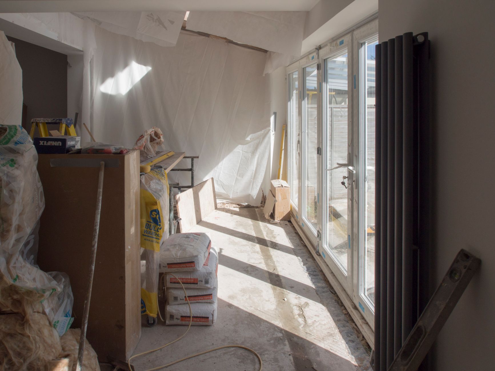
Many Melbourne homes have grown over time in ways their original builders never planned. A rear extension from the 1980s, a garage conversion from a decade later, a bathroom renovation just a few years ago. Each addition made sense in isolation, but together they produce interiors and exteriors that feel visually fragmented. Paint is one of the most practical tools for stitching these spaces together, but only when it's applied with a strategy rather than a bucket.
Why mismatched additions are a colour problem first
The disconnect between additions is rarely structural. It's visual. Different ceiling heights, trims from different eras, render that sits next to brick that sits next to fibre cement: each material reads differently under paint, and treating each space individually makes the problem worse. The goal is to build a palette that creates continuity across surfaces that weren't designed to relate to one another.
Start by walking through the entire home, inside and out, and noting every transition point: where the original structure meets the extension, where timber trim meets plaster, where old cornices stop and flush ceilings begin. These transitions are where visual inconsistency lives. Paint won't remove them, but it can soften them into something that feels deliberate.
Choosing a unifying palette without flattening the character
A single colour across every surface sounds like the simplest fix. It isn't. Applied uniformly, one colour can flatten the architectural character of each space and make the home feel more institutional than cohesive. The better approach is a 70/20/10 palette: one dominant neutral across walls and ceilings, one supporting tone for trims and transitions, and one accent used sparingly on a feature surface.
The dominant neutral does the heavy lifting. It should work in both the original rooms and the additions, which means testing it in both spaces before committing. A warm greige (grey-beige) reads consistently across south-facing original rooms and north-facing extensions in ways that cooler greys don't. For guidance on how light orientation affects colour, the principles in choosing paint colours for a living room with mixed light apply directly to multi-addition homes, where each space may face a different direction.
The trim colour is where you build the strongest visual thread. Use the same trim colour on every skirting board, architrave, window frame and door, regardless of which decade that surface was installed. Consistency here is what tells the eye that the spaces belong together.
Handling the exterior: where the additions are most obvious
On the outside of the home, mismatched additions are impossible to hide. Render sits next to unpainted brick. Weatherboard cladding meets a fibre cement extension. Original eaves overhang at a different pitch to the new addition's fascia. Paint can't change the geometry, but it can minimise the contrast between materials.
The key is to treat the entire exterior as one object. Using the same base colour across all materials, with any variation reserved for trims and details, reduces the visual weight of the transitions. Where two materials meet at a junction, paint the trim colour across both sides of the join. This frames the transition rather than highlighting it.
Sheen matters here too. A satin finish on render reads differently to the same colour in satin on weatherboard, because each surface has a different base texture. For exterior surfaces on homes with varied cladding types, Apex Painting recommends consistent sheen level as a first principle: flat or low-sheen for walls, semi-gloss for trims, without exception across the whole façade.
Interior transitions: managing the joins between eras
Inside the home, the most common tells of an addition are ceiling height changes, cornice profiles that stop mid-hallway, and floor levels that step up or down between spaces. Paint can address some of these visually, though not all.
Where ceiling heights change, resist the urge to paint both ceilings the same bright white. The lower ceiling in the original part of the home will feel oppressive next to a taller extension ceiling painted identically. Instead, use a slightly warmer ceiling tone in lower-ceilinged spaces to bring them down in weight rather than emphasising the difference in height. The techniques covered in using paint to visually resize an awkward room translate well to addition transitions.
Where cornices or architraves change profile between spaces, the trim colour holds the connection. A consistent white or off-white trim runs across both a Victorian-era cornice and a plain square-set finish without reading as a mistake. It reads as a decision.
The hallway as the spine
In a home with multiple additions, the hallway or corridor connecting them is the most important surface to get right. It's the one space every occupant and visitor passes through every time they move from one part of the home to another. A colour that works in the hallway but clashes with the living room at one end and the extension kitchen at the other will make the problem worse.
Treat the hallway as a bridge tone: a mid-point between the warmer palette of the original rooms and the cooler light of the addition. Avoid making the hallway itself a feature; its job is to carry people between spaces, not to announce itself. A tone slightly deeper than the adjacent rooms will frame each doorway without competing with what's on the other side.
When to call in a professional colour consultant
Homes with 3 or more distinct additions across different eras benefit from a professional colour consultation before paint is ordered. Apex Painting works with colour consultants on complex residential projects in Melbourne, particularly where the home has evolved across multiple renovations. The investment in a consultation is small relative to the cost of repainting a full exterior or interior that doesn't read as intended.
A consultant will assess each space in situ, test large swatches in real light conditions and account for how the palette moves between rooms at different times of day. For homes where the additions include a kitchen or wet area, it's also worth reviewing the finish choices carefully: a semi-gloss on extension walls that share a surface with a matte-painted original room will catch light differently and re-introduce the visual inconsistency the colour strategy was trying to resolve.
Practical steps before the first tin is opened
- Map every material type across the home, inside and out, including render, brick, fibre cement, weatherboard and plasterboard.
- Identify every transition point where two materials or two eras meet.
- Choose a base wall colour and test it with large swatches (at least A3 size) in every space, including the additions.
- Lock in one trim colour for the entire home before choosing anything else.
- Check how the palette reads at three times of day: 8am, 1pm and 7pm.
Apex Painting handles residential repaints across Melbourne where additions and extensions are involved, including surface preparation across varied substrates. If you're working with a home that has grown over decades and needs a coherent refresh, Apex Painting can assess the scope and recommend a palette strategy before any work begins.